

Designed UPI International Flow — Global Payments Made Easy
Designed UPI International Flow — Global Payments Made Easy
Background
Federal Bank has over 10 Million users (while writing this post) including 1.5 million NRI users. Many of the users travel to different countries for work or vacation. In 2022, NPCI was operational internationally and the RBI allowed banks to include international UPI. Federal Bank wanted to be one of the early adopters as many of its users who stayed in other countries can use the UPI services where they live. They wanted the service to be easy to use, aligned with the existing designs and offer a unique experience for the users.
Problem Statement
Empower users to transfer funds across countries using UPI.
Setting Scope
Even though the requirement looks quite straightforward, there are few details which need to be addressed. Even though Federal has 10 million users, most of the users are not very comfortable with the technology. You can set up UPI for other bank accounts within the FedMobile app. So that means it should be able to support International UPI for these accounts as well. Even a small miss may confuse the user and lead to a bad experience.
The more the accounts means the more UPIs on the screen (too much information on the screen).
Differentiate between active accounts and inactive accounts.
Set an activation period of 90 days for the service.
Status of the service request.
Highlight that it is an international transaction.
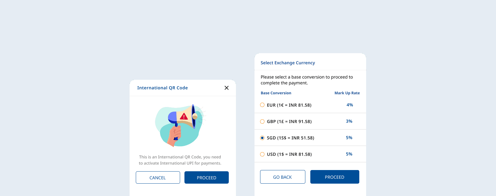
Allow the user to select base currency from multiple currencies.
Show the currency conversion in real time.
Allow the user to enter and edit amounts.
Show the actual amount to be paid after adding markup fee (if applicable).
Differentiate between static and dynamic payments options i.e. user input and pre-defined and few more...
Solutions
For a user making their first international UPI payment, it is of utmost priority to show the payment will be international and also make sure that user has selected a base currency rate based that conversion fee will be charged if applicable. Have provided multiple entry points via Account services and UPI settings. Created a simple flow for the user to set up the international UPI flow. An overlay to let the user know that the scanned code is International and it hasn't been activated yet. Another overlay to let user select base currency conversion. By providing multiple options, the user can select best suited currency.
Background
Federal Bank has over 10 Million users (while writing this post) including 1.5 million NRI users. Many of the users travel to different countries for work or vacation. In 2022, NPCI was operational internationally and the RBI allowed banks to include international UPI. Federal Bank wanted to be one of the early adopters as many of its users who stayed in other countries can use the UPI services where they live. They wanted the service to be easy to use, aligned with the existing designs and offer a unique experience for the users.
Problem Statement
Empower users to transfer funds across countries using UPI.
Setting Scope
Even though the requirement looks quite straightforward, there are few details which need to be addressed. Even though Federal has 10 million users, most of the users are not very comfortable with the technology. You can set up UPI for other bank accounts within the FedMobile app. So that means it should be able to support International UPI for these accounts as well. Even a small miss may confuse the user and lead to a bad experience.
The more the accounts means the more UPIs on the screen (too much information on the screen).
Differentiate between active accounts and inactive accounts.
Set an activation period of 90 days for the service.
Status of the service request.
Highlight that it is an international transaction.
Allow the user to select base currency from multiple currencies.
Show the currency conversion in real time.
Allow the user to enter and edit amounts.
Show the actual amount to be paid after adding markup fee (if applicable).
Differentiate between static and dynamic payments options i.e. user input and pre-defined and few more...
Solutions
For a user making their first international UPI payment, it is of utmost priority to show the payment will be international and also make sure that user has selected a base currency rate based that conversion fee will be charged if applicable. Have provided multiple entry points via Account services and UPI settings. Created a simple flow for the user to set up the international UPI flow. An overlay to let the user know that the scanned code is International and it hasn't been activated yet. Another overlay to let user select base currency conversion. By providing multiple options, the user can select best suited currency.
Segmented Controls showing applicable accounts under the selected segment. This not only helps in showing filtered data but also helps the user to stay on the same screen. The user can select the appropriate section to view the accounts.
Segmented Controls showing applicable accounts under the selected segment. This not only helps in showing filtered data but also helps the user to stay on the same screen. The user can select the appropriate section to view the accounts.

To show status of the accounts whether they are active or not, use additional text with differentiated toggle buttons. The toggles which were used in the rest of the FedMobile, are used here as well to maintain familiarity. But for scheduled activation, there were no existing toggle components. So a shade of secondary colour is used to differentiate the account from other active or inactive accounts.
Based on the guidelines, an activation period of 90 days had to be implemented. After 90 days, the service will be auto deactivated and if the user can continue to use it by re-activating. So, while activating an account for the first time, make sure the user has to select the start date and end date of their service. After selecting the start date, from day 91 is disabled so that we can comply with the guidelines and also the user had to select within 90 days. If the account is activated, the start and end date of their service is shown so acknowledge the user.
It was important to show the status of the service request, few of them activated instantly and while others were scheduled. The user can modify or revoke activation of scheduled service on the same layout, but used an overlay to re-confirm about the change of days and also provided an option to cancel the scheduled service.

One of the challenging parts of the module was to design which shows the real time currency conversion. The primary objective was to show the conversion, while the secondary was to let users edit either of the currencies. Made multiple designs which were most appropriate or suitable for banking users. If the detail "Banking user" was missed then it would have been another currency conversion tool, which was not acceptable. If the user enters the amount in base currency the payable currency is disabled/ greyed out and shows the real time conversion and vice versa. The option to do both is empowering the user without worrying about the calculations. This gives certainty to the user, who otherwise may be confused or afraid of making a transaction based on the actual amount. When the input field is active the background of the flag turns blue and the other currency is greyed out and a blue stroke is added to the flag.
One of the challenging parts of the module was to design which shows the real time currency conversion. The primary objective was to show the conversion, while the secondary was to let users edit either of the currencies. Made multiple designs which were most appropriate or suitable for banking users. If the detail "Banking user" was missed then it would have been another currency conversion tool, which was not acceptable. If the user enters the amount in base currency the payable currency is disabled/ greyed out and shows the real time conversion and vice versa. The option to do both is empowering the user without worrying about the calculations. This gives certainty to the user, who otherwise may be confused or afraid of making a transaction based on the actual amount. When the input field is active the background of the flag turns blue and the other currency is greyed out and a blue stroke is added to the flag.
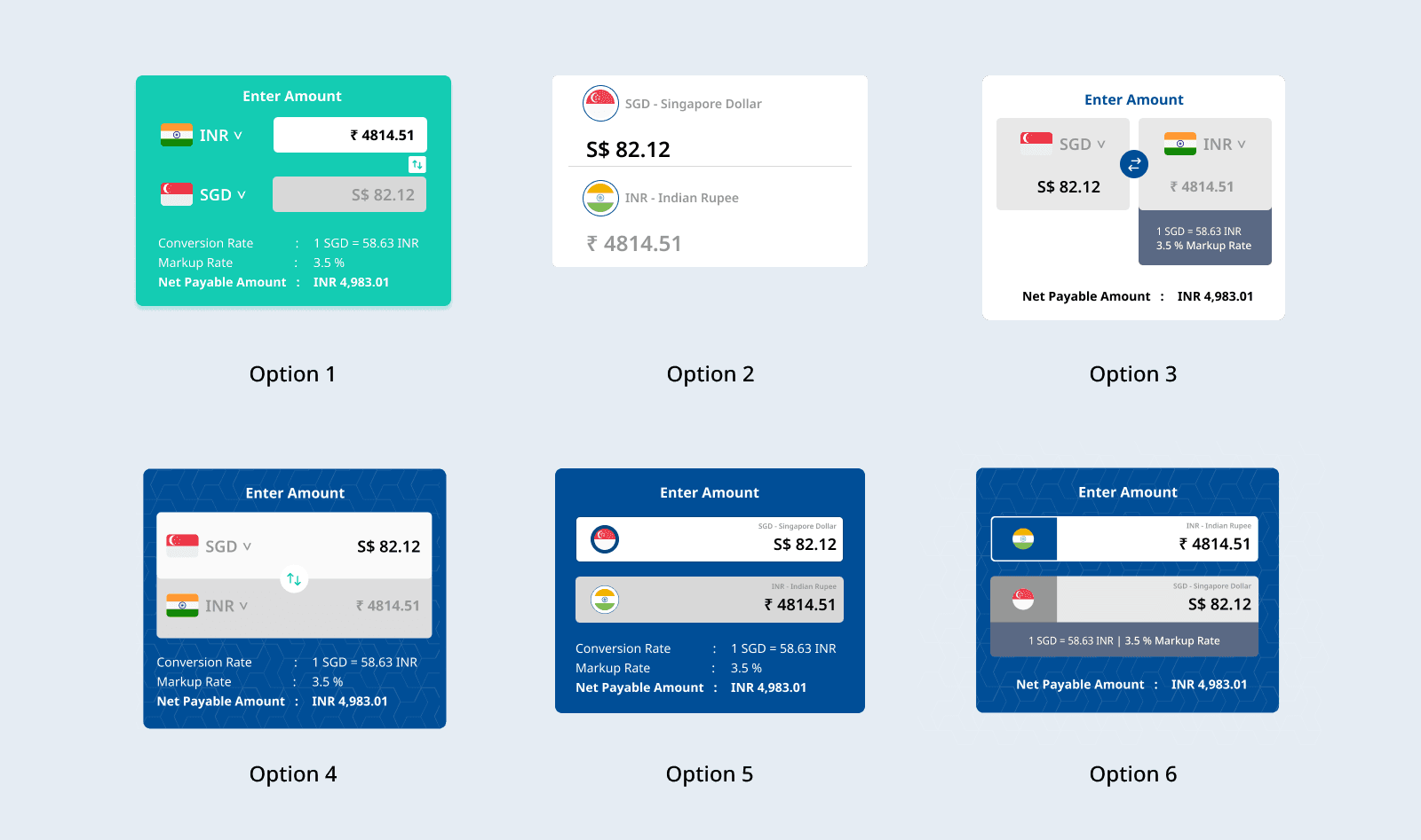
Another requirement was to show the mark up fee (if applicable) up front, do the calculation and let the user know how much will be deducted for the account. As everything happens on the same screen, there was a rare chance of the wrong amount being transferred.
Another important distinction was needed, i.e. payment type, static or dynamic. Static payment will be best used for the payment where the amount is predetermined like a request from Amazon. The fields are greyed out so that the amount is not editable and also show the total deductible amount after adding the mark up fee. For dynamic, the user can edit the amount and complete the payment.
Ribbons with text, International were added to transaction details screens to differentiate from other UPI payments.

Based on the available components, I proceeded to create the final designs, ensuring alignment with the existing design system. The ultimate objective was to deliver a seamless user experience for those already acquainted with the designs. While the introduction of new components may present a slight learning curve, the intuitive familiarity of the system will guide users through their transactions effortlessly.
Based on the available components, I proceeded to create the final designs, ensuring alignment with the existing design system. The ultimate objective was to deliver a seamless user experience for those already acquainted with the designs. While the introduction of new components may present a slight learning curve, the intuitive familiarity of the system will guide users through their transactions effortlessly.

Few minor tweaks
Overall the experience was improved by adding few tweaks like copy to clipboard option for the transaction/reference number, refresh option if the payment was pending, remark section, proper error message in case transaction was incomplete or failed, showing a verified merchant text, an overlay consisting summary before entering the UPI pin to complete the transaction.