

FedMobile Home Screen Revamp Design Process
FedMobile Home Screen Revamp Design Process
Previous Designs and Decisions
Before delving into the new designs, it is crucial to understand how the existing design was created and the underlying decisions behind it. Are there any insights that we should consider? Why were specific modules given importance?
Upon reviewing the previous PRDs, we discovered some insights beyond UI and UX improvements:
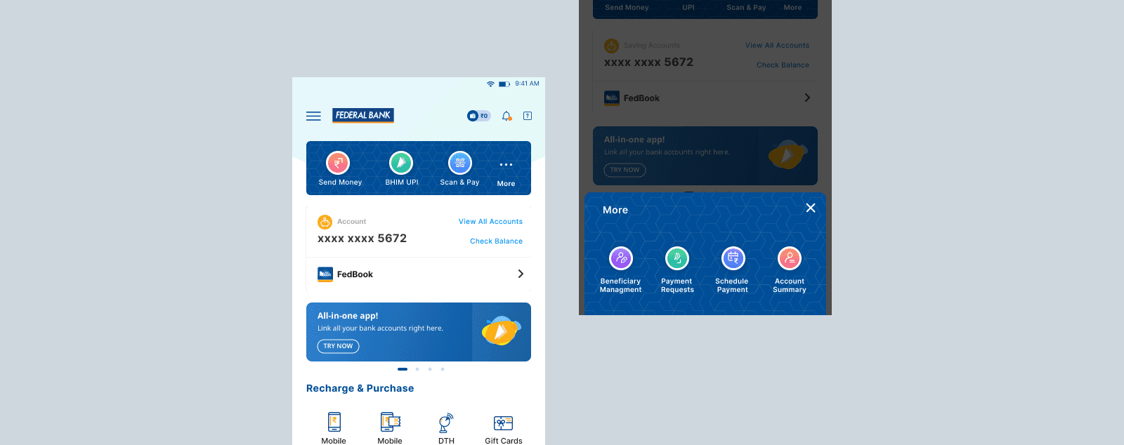
Credit Card: Given its introduction, it was prioritised in the navigation bar to make it prominent.
Ad banners: The bank frequently offers interest rate hikes or specific loan discounts, making it essential to convey these messages to users through banners.
Bill Payments: Integration of new modules and the effort to display them on the Home Screen enables users to conveniently perform mobile recharges and similar payments.
Payment Card: Important modules related to banking activities were introduced with priority and designed distinctly for easy identification and usage by users.
Previous Designs and Decisions
Before delving into the new designs, it is crucial to understand how the existing design was created and the underlying decisions behind it. Are there any insights that we should consider? Why were specific modules given importance?
Upon reviewing the previous PRDs, we discovered some insights beyond UI and UX improvements:
Credit Card: Given its introduction, it was prioritised in the navigation bar to make it prominent.
Ad banners: The bank frequently offers interest rate hikes or specific loan discounts, making it essential to convey these messages to users through banners.
Bill Payments: Integration of new modules and the effort to display them on the Home Screen enables users to conveniently perform mobile recharges and similar payments.
Payment Card: Important modules related to banking activities were introduced with priority and designed distinctly for easy identification and usage by users.
What we have: Research, Competitive Analysis, Data
One final step before commencing the design process is to assess what we currently have and determine how we can gather insights that will help us analyse user behaviour, identify the most used modules, and understand their expectations for the new design.
User Interviews: User needs can be better understood through user interviews, but it's important to note that our access to user research is limited due to reasons associated with the banking industry.
Competitive Analysis: Conducting a comprehensive analysis of our competitors is essential, as there are numerous competitors who continuously introduce new upgrades to their mobile apps.
Data Analysis: Analysing how users interact with the mobile app or website provides valuable insights that can be even more significant than some forms of research.
User Interviews
Despite our earlier mention of limited access, we proceeded to gather as much information as possible. We employed three types of feedback collection methods:
First, we distributed a questionnaire to both existing and new users who accessed FedMobile.
Second, we conducted individual interviews to obtain qualitative data.
Lastly, we organised a couple of group session among users to delve deeper into their comments, feedback, and suggestions specifically regarding the home screen. We also sought insights on any improvements they anticipate for the overall FedMobile app experience.
Design Process
I took the lead in the design process and spearheaded a 5-day sprint in collaboration with fellow designers and product managers who were involved in the FedMobile project. Our aim was to concentrate on making improvements and implementing changes without any distractions. We highly valued the feedback and suggestions from each team member, making an effort to understand their perspectives. This process ensured that everyone was aligned and shared a common understanding when it came to revamping the app, prioritising both user needs and business requirements.
Day - 1 : Map
I aimed to establish structured conversations to lay a strong foundation, enabling us to concentrate on the sprint week effectively. This structured approach allowed the team to efficiently go through a significant amount of information. The agenda for the discussions included:
Defining key questions and long-term goals
Narrowing down requirements
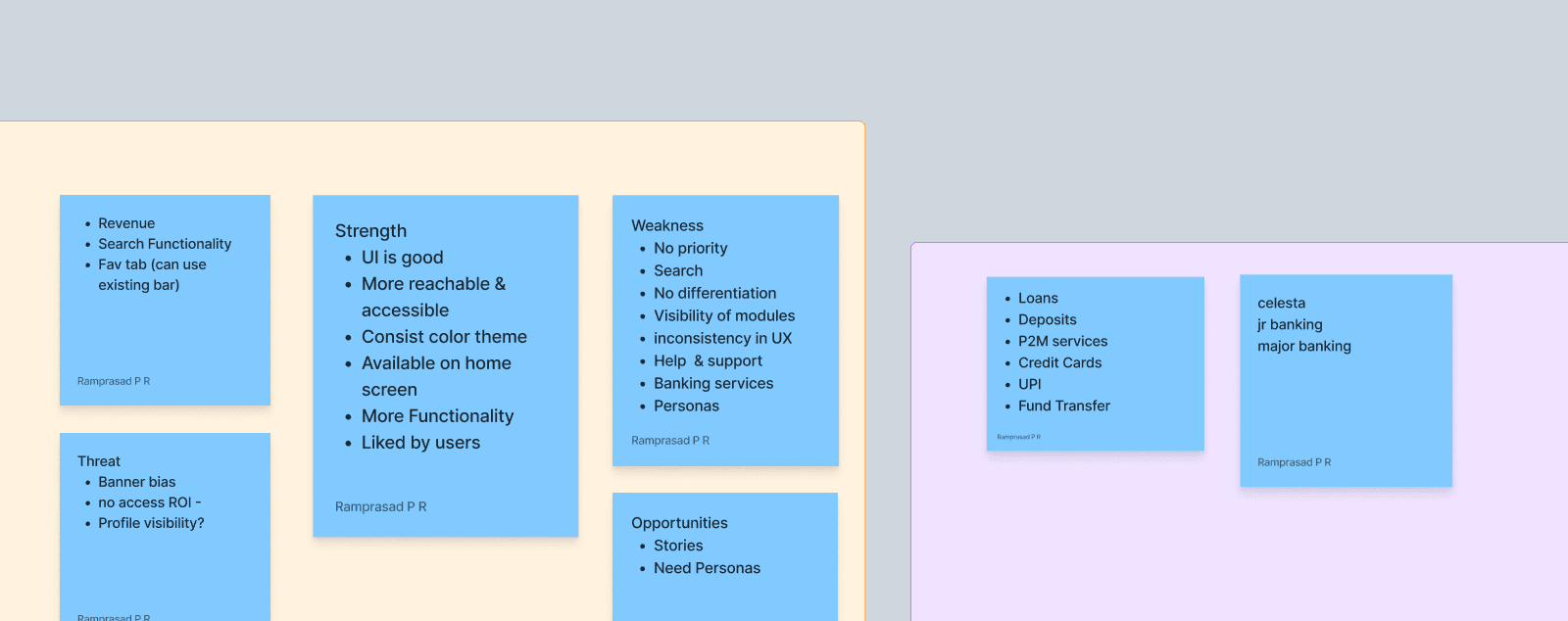
Conducting a SWOT analysis of the existing design
Focusing on the ideal user flow for a satisfying user experience
Lastly, selecting specific targets that needed to be addressed moving forward.
Day - 1 : Map
I aimed to establish structured conversations to lay a strong foundation, enabling us to concentrate on the sprint week effectively. This structured approach allowed the team to efficiently go through a significant amount of information. The agenda for the discussions included:
Defining key questions and long-term goals
Narrowing down requirements
Conducting a SWOT analysis of the existing design
Focusing on the ideal user flow for a satisfying user experience
Lastly, selecting specific targets that needed to be addressed moving forward.
Day - 2 : Competitive Analysis and Sketch
After establishing a solid foundation and conducting crucial discussions, we transitioned to the competitive analysis phase. I collected all the previously assigned homework and moderated a session to assess our positioning relative to our competitors. Following the analysis, we proceeded to demonstrate some of the functionalities we intended to implement. This step enabled us to gain a deeper understanding of the technical aspects and features that we could develop for our end users.
Conducted a comprehensive competitive analysis where everyone actively contributed their thoughts and insights. This analysis helped us gain a deeper understanding of the market landscape, identify trends, and benchmark our design against competitors. We examined various aspects such as user experience, visual design, functionality, and overall performance. The collaborative effort ensured a holistic perspective and enabled us to make informed design decisions that would set us apart from the competition.
With the initial stages complete, we dived into sketching. I facilitated a moderated brainstorming activity, known as a cray-eight session, which allowed us to channel our thoughts and translate ideas into tangible concepts. This collaborative exercise proved immensely valuable as it generated a wide range of variations that wouldn't have been possible with just one individual's input.
As a home assignment, I requested each team member to share screenshots of the mobile banking apps they personally use, both with their families and friends. Additionally, I encouraged them to share any design inspirations they had come across.

Day - 3 : Decide
We were faced with a multitude of solutions in the form of sketches, and our next step was to determine which of these designs should be prototyped and tested. To begin, we thoroughly reviewed each design and identified the elements that we believed were effective. This was followed by a process called Rumble, where we compared and contrasted different designs to ensure that our initial perceptions were logical and valid. Lastly, we created storyboards to illustrate the use cases in a visual narrative format.

Day - 4 : Wireframing and Prototype
Now it was my responsibility to deliver the high-fidelity design along with all the necessary flows. I utilized the design system (which is covered in a separate case study) and strived to execute the planned design concepts discussed during the sprint. Since we had already covered the low-fidelity designs physically, it made sense to skip that step. With everyone aligned and on the same page, the design process became somewhat easier. In total, we created 10 different designs as we aimed to experiment and present them to the stakeholders who would ultimately make the final decision.
Day - 4 : Wire-framing and Prototype
Now it was my responsibility to deliver the high-fidelity design along with all the necessary flows. I utilized the design system (which is covered in a separate case study) and strived to execute the planned design concepts discussed during the sprint. Since we had already covered the low-fidelity designs physically, it made sense to skip that step. With everyone aligned and on the same page, the design process became somewhat easier. In total, we created 10 different designs as we aimed to experiment and present them to the stakeholders who would ultimately make the final decision.
Day - 5 : Testing
Once the designs were completed, everyone had the opportunity to review them and provide feedback. This valuable input allowed us to make any necessary minor modifications that may have been missed initially, ensuring that the designs were refined before presenting them to the stakeholders.
Design System Tweaks
Before proceeding, I would like to emphasise that we had to create new components and introduce new elements into the design system. When undertaking a significant revamp like this, it becomes essential to update and enhance the design system to ensure its relevance for future use.
Variations
We generated a total of 10 experimental variations, which may seem like a lot, but it provided stakeholders with a visual representation of FedMobile and allowed them to express their desired vision for the app.
After finalizing the design, I proceeded to create multiple iterations of various components and achieved a cohesive home screen. This approach enabled me to experiment with each element individually, enhancing the overall visual experience.
To arrive at the ultimate solution, I developed:
10 mid-fidelity designs
6 UI-related modifications
15 account cards
14 navigation bars, including 8 styles of micro-interactions
2 app prototypes
