
Overhauling UX for Federal Bank's FedMobile
Overhauling UX for Federal Bank's FedMobile
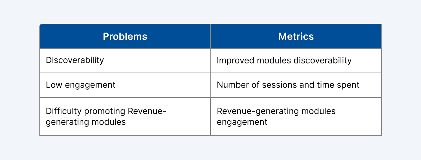
The Problem
Users of FedMobile, a banking app with 19+ million customers, struggled with cluttered navigation, failed to discover features/modules and found unintuitive actions, leading to frustration and increased support requests for basic tasks. With 67% of banking services receiving less than 5% user engagement, Federal Bank was losing significant cross-selling opportunities and revenue potential from the existing UX.
The Solution
I led comprehensive UX research, audit and redesign of the app's core flows, simplifying information architecture, consolidating redundant features, and introducing modular cards for scalability. The new design prioritizes usability, speed, and accessibility, especially for mobile-first users across India's diverse digital landscape.
The Outcome
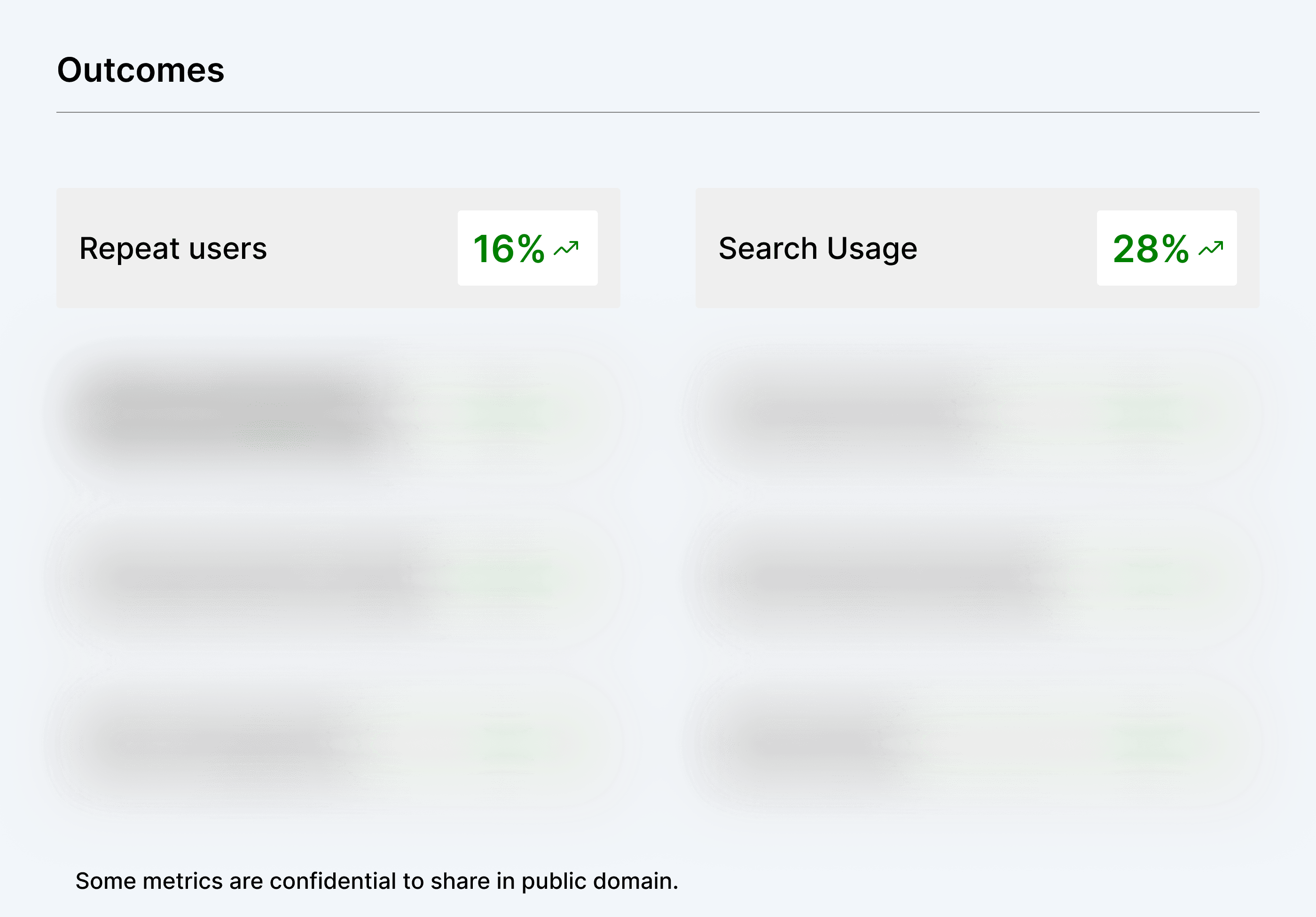
The redesign delivered measurable business impact with 28% adoption of search functionality and 16% increase in repeat users. The structured layout made revenue-generating modules more effectively, boosting engagement rates. Enhanced visibility of business-critical features reduced promotional difficulties while positive user feedback confirmed the new layout's effectiveness in building trust and satisfaction.
The Problem
Users of FedMobile, a banking app with 19+ million customers, struggled with cluttered navigation, failed to discover features/modules and found unintuitive actions, leading to frustration and increased support requests for basic tasks. With 67% of banking services receiving less than 5% user engagement, Federal Bank was losing significant cross-selling opportunities and revenue potential from the existing UX.
The Solution
I led comprehensive UX research, audit and redesign of the app's core flows, simplifying information architecture, consolidating redundant features, and introducing modular cards for scalability. The new design prioritizes usability, speed, and accessibility, especially for mobile-first users across India's diverse digital landscape.
The Outcome
The redesign delivered measurable business impact with 28% adoption of search functionality and 16% increase in repeat users. The structured layout made revenue-generating modules more effectively, boosting engagement rates. Enhanced visibility of business-critical features reduced promotional difficulties while positive user feedback confirmed the new layout's effectiveness in building trust and satisfaction.
Overview
Overview
Introduction
Introduction
FedMobile is the official mobile banking app from Federal Bank — one of India’s leading private sector banks. With the trust of over 19 million customers, including 1.5 million NRIs, the bank has a strong footprint across India and international reach through representative offices in Abu Dhabi, Qatar, Kuwait, Oman, and Dubai. The app has crossed 10+ million downloads across the Google Play Store and Apple App Store, making it a trusted choice for seamless and secure banking.
FedMobile is the official mobile banking app from Federal Bank — one of India’s leading private sector banks. With the trust of over 19 million customers, including 1.5 million NRIs, the bank has a strong footprint across India and international reach through representative offices in Abu Dhabi, Qatar, Kuwait, Oman, and Dubai. The app has crossed 10+ million downloads across the Google Play Store and Apple App Store, making it a trusted choice for seamless and secure banking.
My Role in the Project
My Role in the Project
As the Product Designer, I was responsible for redesigning the FedMobile app experience by ensuring functional and visual consistency across the app:
Conducted user research and design audits to uncover usability gaps and pain points.
Defined scalable design guidelines to drive visual and UX consistency.
Collaborated with Product and Engineering to align on user needs and business goals.
Delivered high-fidelity mockups and prototypes to validate and communicate design solutions.
Led design reviews and facilitated cross-functional discussions to ensure cohesive implementation.
Team
Team
Product Managers : Niharika, Swati, Varun
iOS Developers : Kwanzo, Rohan
Android Developers : Ankur, Snehil
QA : Chiru, Pavan
Product Designer : Ram
Product Managers : Niharika, Swati, Varun
iOS Developers : Kwanzo, Rohan
Android Developers : Ankur, Snehil
QA : Chiru, Pavan
Product Designer : Ram
Timeline
Timeline
~ 6 Months
~ 6 Months
Business Context
Business Context
Federal Bank operates in India's intensely competitive digital banking landscape. Customer expectations are shaped by sleek fintech apps while regulatory requirements demand comprehensive service offerings.
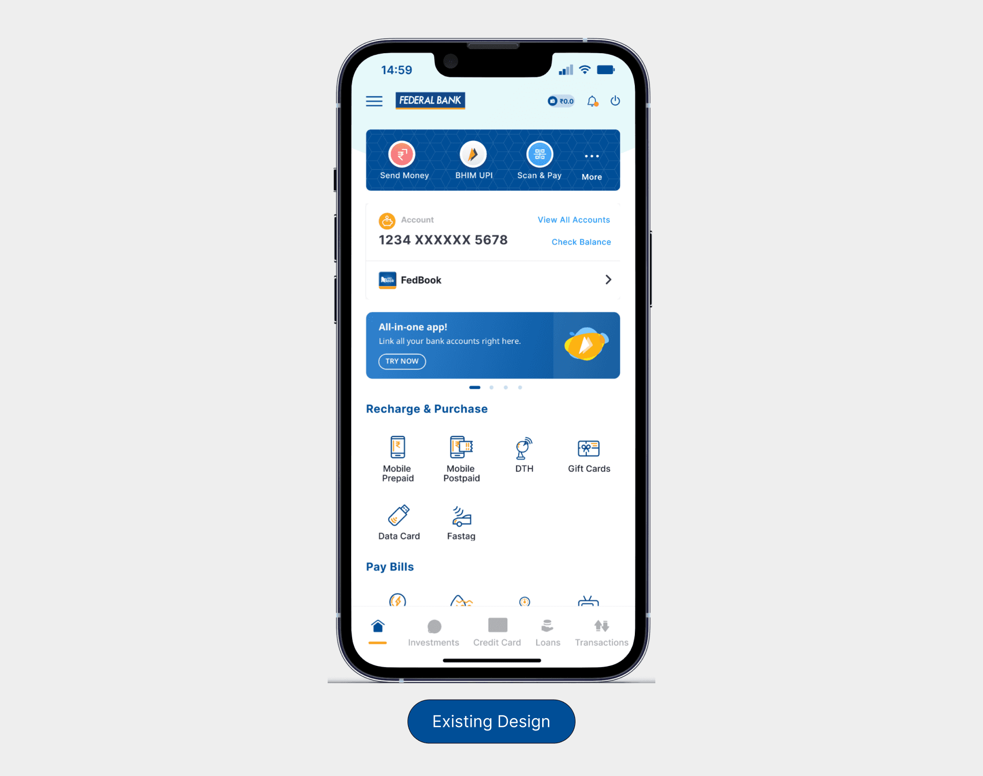
Despite its 10+ million downloads, the app struggled with feature discoverability.
67% of available banking services received fewer than 5% user engagement.
Low engagement in banking and lifestyle modules, directly impacting cross-selling opportunities and revenue growth.
Fintech apps are way ahead in UX, and banks need to retain and engage their customers.
With over 19 million customers, the bank needed to balance serving tech-savvy urban users alongside traditional customers with varying digital literacy levels.
Federal Bank operates in India's intensely competitive digital banking landscape. Customer expectations are shaped by sleek fintech apps while regulatory requirements demand comprehensive service offerings.
Despite its 10+ million downloads, the app struggled with feature discoverability.
67% of available banking services received fewer than 5% user engagement.
Low engagement in banking and lifestyle modules, directly impacting cross-selling opportunities and revenue growth.
Fintech apps are way ahead in UX, and banks need to retain and engage their customers.
With over 19 million customers, the bank needed to balance serving tech-savvy urban users alongside traditional customers with varying digital literacy levels.
Why it was necessary
Why it was necessary
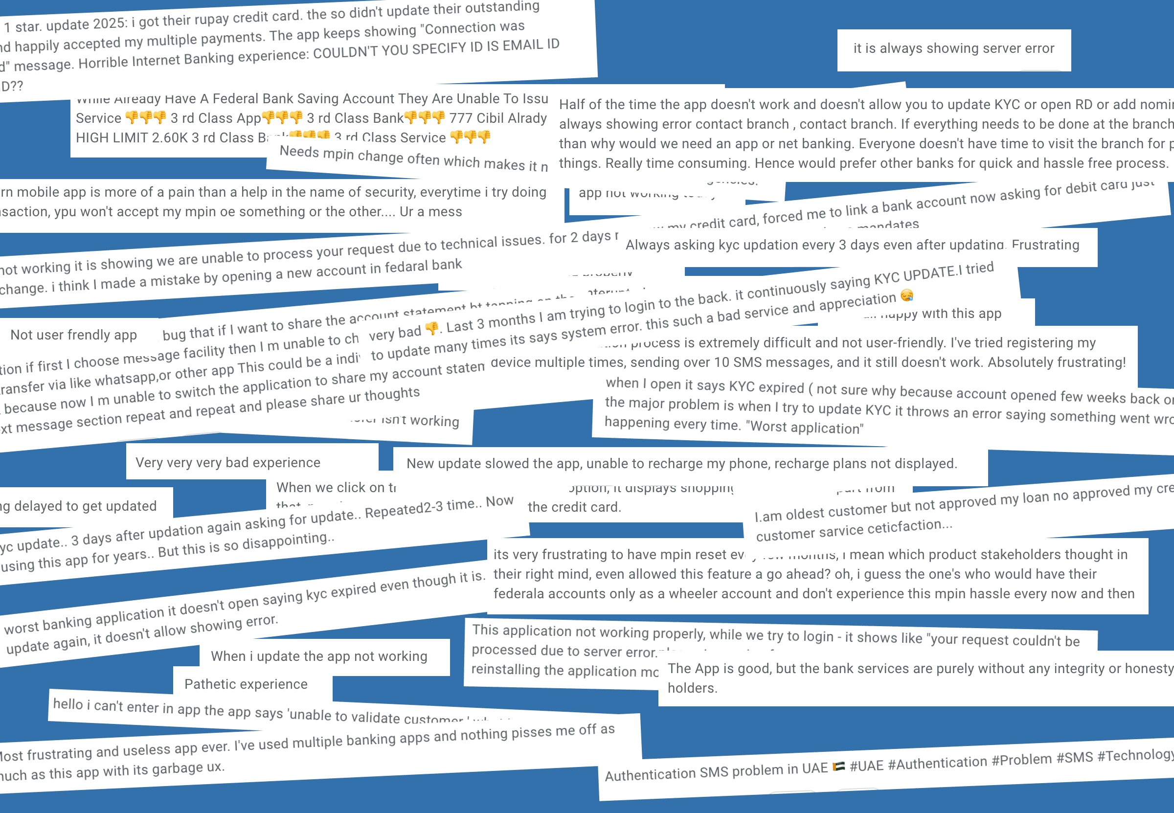
This redesign wasn't initiated for visual modernisation; it was prompted by alarming business metrics that revealed a critical disconnect between user behaviour and revenue potential.
Analytics showed that despite having 10+ million active users, Federal Bank was experiencing stagnant cross-selling rates and increasing customer support costs, with 23% of support inquiries related to features users simply couldn't find.
When two-thirds of banking services go unnoticed by users, we're not just missing business opportunities but also failing to serve customers who might genuinely benefit from those financial products.
For millions of users who rely on the app as their primary banking touchpoint, navigation friction wasn't just an inconvenience; it was a barrier to accessing essential financial services that could improve their economic well-being.
Problem 1 : Lack of search affects discoverability
As modules increase every passing month, users struggle to find what they need, slowing down task completion and reducing engagement.
Example
The absence of a search feature makes it difficult for users to locate specific modules as the number of available options continues to grow. Users are forced to scroll and manually explore, or need to navigate deep for modules, leading to frustration and task abandonment.
Impact
Without search or discoverability support, users struggle to navigate efficiently, resulting in poor engagement and decreased usage of key modules across the platform.
Problem 1 : Lack of Search Affects Navigation and Usability
As modules increase, users struggle to find what they need—slowing down task completion and reducing engagement.
Example
The absence of a search feature makes it difficult for users to locate specific modules as the number of available options continues to grow. Users are forced to scroll and manually explore, or need to navigate deep for modules—leading to frustration and task abandonment.
Impact
Without search or discoverability support, users struggle to navigate efficiently, resulting in poor engagement and decreased usage of key modules across the platform.
Problem 2 : Less visibility for key banking services
We’re missing the opportunity to showcase core banking modules on the primary home screen. Right now some features are hidden under parent category which user are not aware of.
Example
Important banking services like deposits, loans, or card management are not featured prominently on the home screen. Users often overlook these modules or assume they aren’t available, reducing their chances of interaction and usage.
Impact
Without visible access to key services, user engagement drops and cross-selling opportunities are lost, limiting overall platform value and business impact.
Problem 3 : Inconsistent Components
Visually similar CTAs trigger different actions, leading to user confusion. While some modules are accessible via overlays only while others are hidden in the hamburger menu.
Example
Buttons with the same design language serve unrelated purposes, one displays balance in-place, while another redirects users to the “All Accounts” screen. This inconsistency breaks user expectations and causes hesitation or misclicks.
Impact
When design patterns don’t match their expected behavior, users lose trust in the interface. This increases cognitive load, reduces efficiency, and leads to frustration and drop-offs during key tasks.
Problem 4 : Lack of Module Prioritization
Modules under each category are not organised by usage or relevance.
Example
Within parent categories like "Payments" or "Investments," all modules are presented in a flat, non-prioritized order. High-usage features are buried among rarely accessed ones, making frequent tasks harder to reach.
Impact
This slows down task completion and adds friction to the user journey. By not surfacing the most-used modules first, we miss opportunities to enhance engagement and user satisfaction.
Problem Statement
Problem Statement
We wanted to improve key business metrics:
We wanted to improve key business metrics:
Business Goals
Business Goals
Improve discoverability of revenue-generating modules: Ensure key services are easily found to increase engagement and drive business outcomes.
Boost overall user engagement: Encourage users to explore beyond routine tasks by surfacing relevant and contextual modules, improving session time and interactions.
Enable scalable and targeted promotion: Introduce personalization and modular prioritization to surface high-value features to the right audience at the right time.
User Goals
User Goals
Easily discover what they need: Reduce cognitive load with search functionality, clear categorization, and relevant suggestions for faster task completion.
Get a personalized and relevant experience: Customize module visibility and ordering based on usage patterns to align with individual user goals.
Use with confidence and clarity: Ensure consistent behavior and visual language across the app, reducing confusion and building trust in the experience.
Scope & Roadmap
Scope & Roadmap
While the ultimate objective was to revamp the entire application, we strategically focused on the home screen as our starting point. This phased approach allowed us to tackle the most critical user touchpoint first, the screen where users begin their banking journey and make decisions about which services to explore.
The home screen redesign would serve as the foundation for broader application improvements.
Remaining screens to be updated progressively over time.
New modules would automatically incorporate the updated design patterns and components, ensuring consistency while avoiding the need for future rework across the entire application ecosystem.
Research
Research
Previous Designs and Decisions
Before delving into the research, it is crucial to understand how the existing design was created and the underlying decisions behind it. Are there any insights that we should consider? Why were specific modules given importance?
Upon reviewing the previous PRDs and user research documents, we discovered key insights beyond UI and UX improvements:
Credit Card: Given its introduction, it was prioritised in the navigation bar to make it prominent.
Ad banners: The bank frequently offers interest rate hikes or specific loan discounts, making it essential to convey these messages to users through banners.
Bill Payments: Integration of new modules and the effort to display them on the Home Screen enables users to conveniently perform mobile recharges and similar payments.
Payment Card: Important modules related to banking activities were introduced with priority and designed distinctly for easy identification and usage by users.
Data from CleverTap
Data from CleverTap
CleverTap analytics have been integrated into FedMobile for comprehensive user behavior tracking, conversion funnel analysis, and real-time engagement monitoring to gather actionable insights related to user activities and how those patterns directly impact business outcomes and revenue generation. It served as our foundation, providing hard evidence of user behavior patterns across FedMobile's massive user base. The data revealed concerning trends:
While users were logging in regularly, they were severely underutilizing the app's banking capabilities.
Heat map analysis revealed that users concentrated their interactions on just 2-3 modules, leaving 67% of available banking services virtually untouched.
Lifestyle modules like bill payments, mobile recharges, and gift cards showed only 12% engagement despite being high-frequency use cases in competitor apps.
Travel booking modules registered less than 3% user interaction, indicating a complete disconnect between available services and user awareness and ongoing offers.
Session abandonment rates peaked at 45% when users attempted to navigate beyond primary banking functions, suggesting significant friction in the user journey.
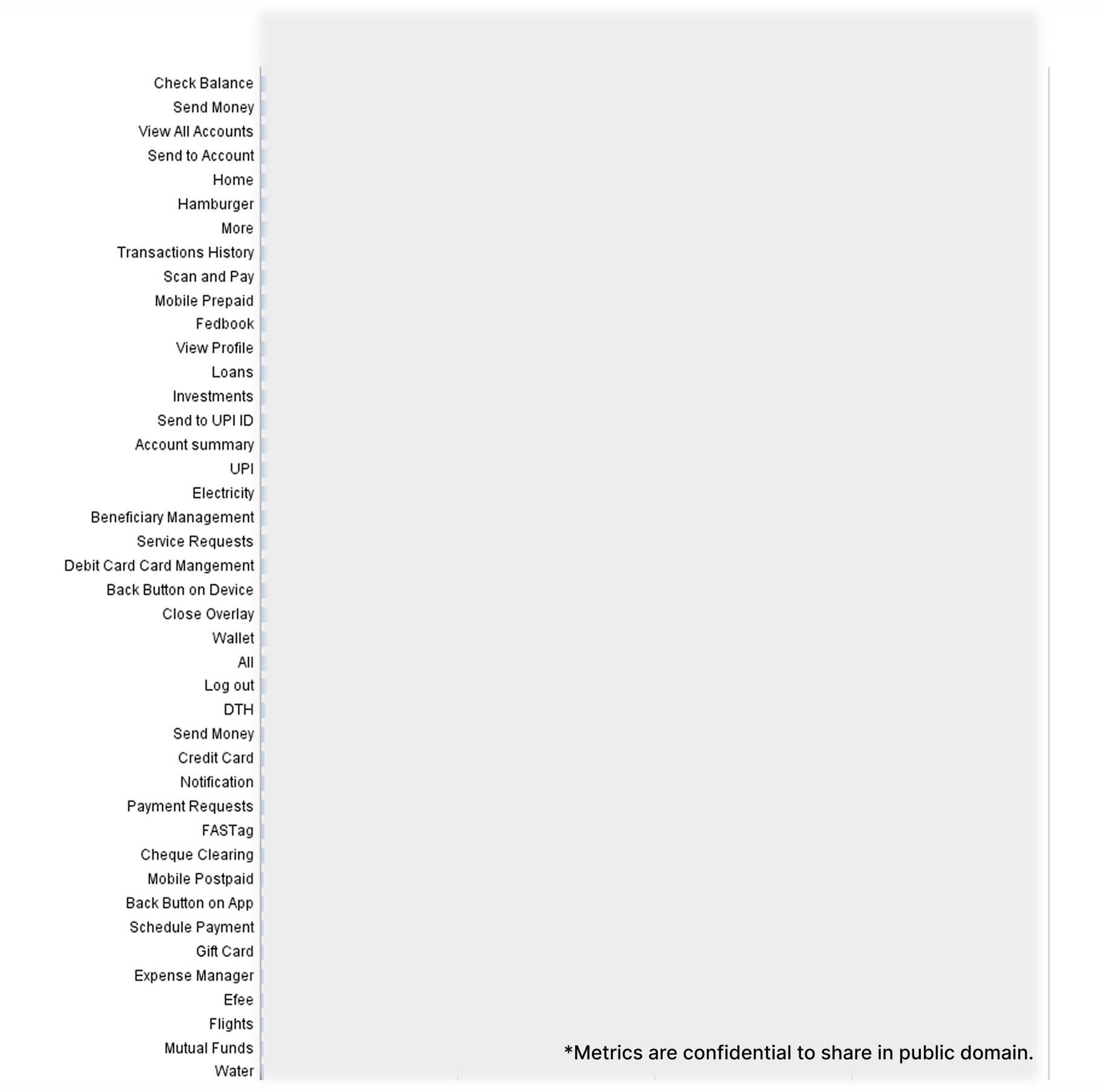
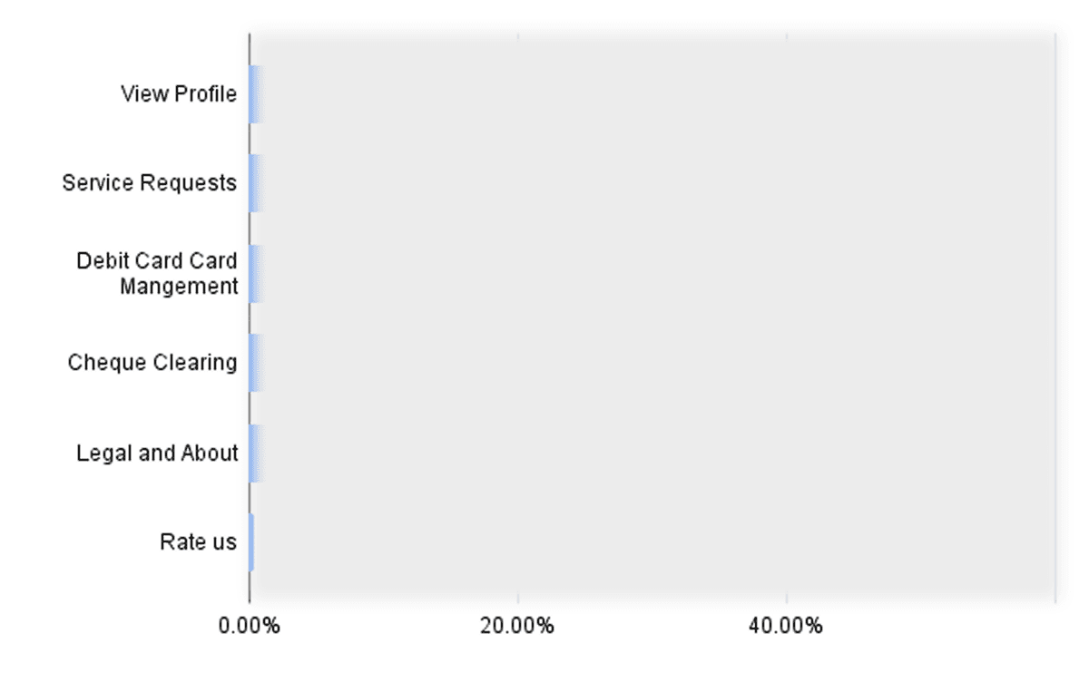
I synthesized extensive data from our analytics, though I can only display blurred versions due to confidentiality restrictions. Below are two representative charts from the 30+ visualizations we created to map user behavior patterns, extract actionable insights, and identify any gaps in our understanding.
I synthesized extensive data from our analytics, though I can only display blurred versions due to confidentiality restrictions. Below are two representative charts from the 30+ visualizations we created to map user behavior patterns, extract actionable insights, and identify any gaps in our understanding.
User Research & Interviews
User Research & Interviews
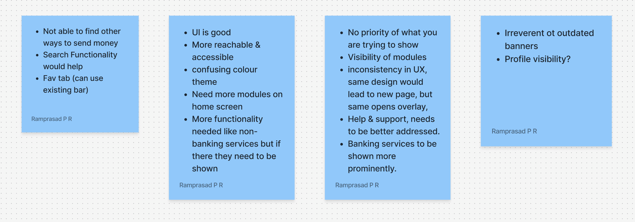
With quantitative data in hand, I wanted to understand behavioral patterns of the users and also to understand why a person is FedMobile and for what purpose. Banking industry have regulations to limit direct access to users, however, I managed to conduct some much-needed user interviews followed by structured questionnaires and recording of activities.
The conversations revealed that users weren't avoiding features intentionally but they simply couldn't find them.
Many expressed surprise when shown banking services they didn't know existed, particularly investment, non-banking, lifestyle, and loan products that could genuinely benefit their financial goals.
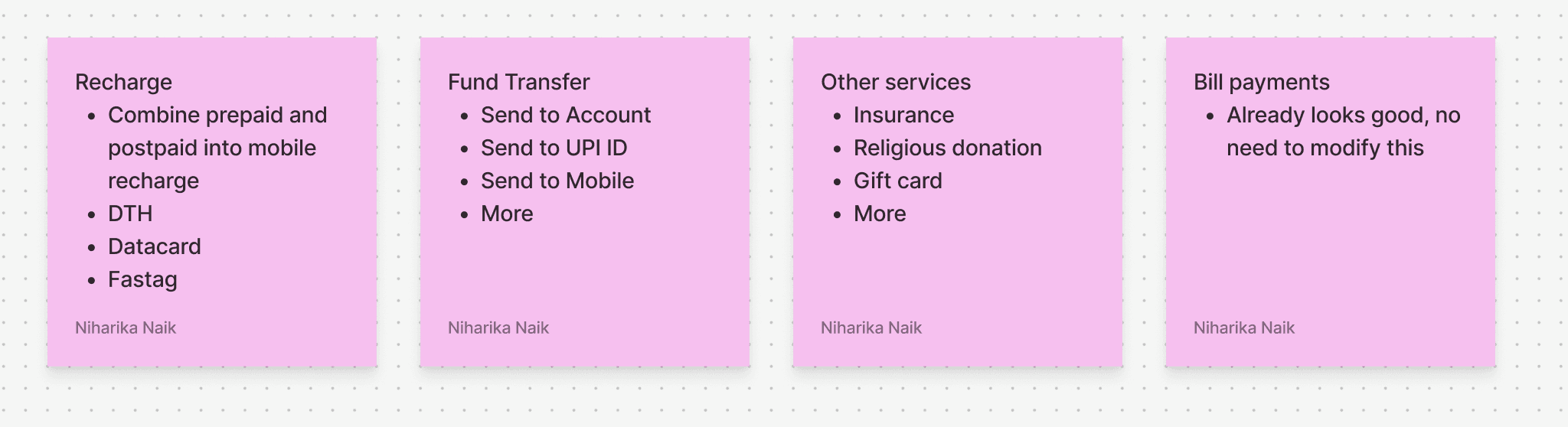
We tried to categories some sections based on feedback to better address the needs of the users and validated them.
Session recordings showed users frequently scrolling and searching manually, indicating clear navigation difficulties that were costing both user satisfaction and business revenue.
With quantitative data in hand, I wanted to understand behavioral patterns of the users and also to understand why a person is FedMobile and for what purpose. Banking industry have regulations to limit direct access to users, however, I managed to conduct some much-needed user interviews followed by structured questionnaires and recording of activities.
The conversations revealed that users weren't avoiding features intentionally but they simply couldn't find them.
Many expressed surprise when shown banking services they didn't know existed, particularly investment, non-banking, lifestyle, and loan products that could genuinely benefit their financial goals.
We tried to categories some sections based on feedback to better address the needs of the users and validated them.
Session recordings showed users frequently scrolling and searching manually, indicating clear navigation difficulties that were costing both user satisfaction and business revenue.
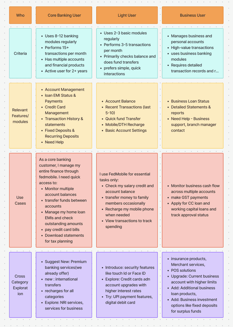
Personas
Personas
Research helped to narrow down or map users into three distinct user segments, each with unique needs and behaviors. Understanding these personas became crucial for prioritizing home screen real estate and designing appropriate user flows for future features.
Research helped to narrow down or map users into three distinct user segments, each with unique needs and behaviors. Understanding these personas became crucial for prioritizing home screen real estate and designing appropriate user flows for future features.
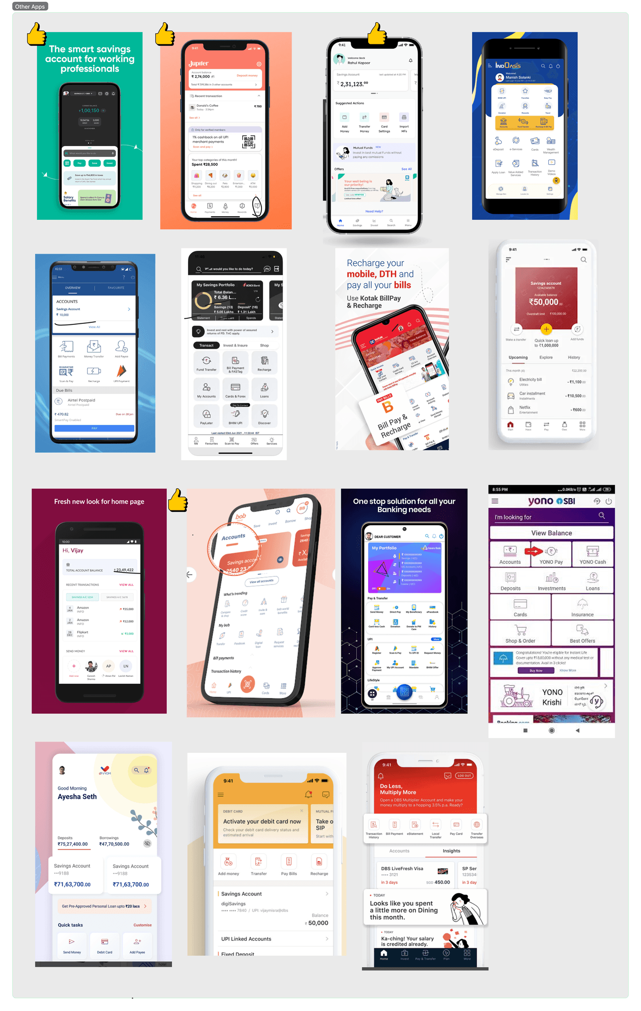
Competitive Analysis
Competitive Analysis
I have analysed 18 Indian banking applications and 2 international banks and 11 fintech apps.
The scenario are same for other banking apps also and this was due to the sheer number of features consisting of banking, investment, loans, lifestyles and other non banking.
Competitor apps also lacked effective discoverability and navigation, and most struggled with similar information hierarchy problems.
Fintech applications consistently outperformed traditional banks in UX simplicity, creating pressure for established banks to modernize without losing their comprehensive offerings.
Opportunity for differentiation through superior information architecture.
Design Constraints
Design Constraints
Working within the banking industry presented unique challenges that shaped our approach from day one.
The existing design system required new updates to support new component types while maintaining consistency across the platform.
Additionally, accommodate backend-configured modules for business teams to promote specific products.
Meet strict accessibility standards and performance requirements for diverse device capabilities across Indian markets.
Technical Constraints
Technical Constraints
The app's architecture needed to support seamless integration of new search functionality.
Customisable module arrangements without compromising performance or security standards.
Legacy code considerations meant that certain interaction patterns had to work within existing technical frameworks, particularly around the credit card SDK integration that created navigation inconsistencies.
Design solutions that could scale efficiently as the number of banking modules continued to grow, ensuring that increased functionality wouldn't negatively impact load times or user experience across different network conditions.
Design Iterations
Design Iterations
I began with extensive hand-drawn sketches exploring various approaches to module organisation, search placement, and information hierarchy. Product Managers wanted to participate in the sketching process to get a feel of it before providing feedback.
Generated over 30 initial concept sketches ranging from card-based, boxes with ourtlines, different layout options, conservative design that simply reorganised existing elements.
The collaborative sketching sessions led to disagreements about user priorities, some sketches prioritized visual appeal with large imagery and minimal text.
One design had information density to surface more banking services simultaneously.
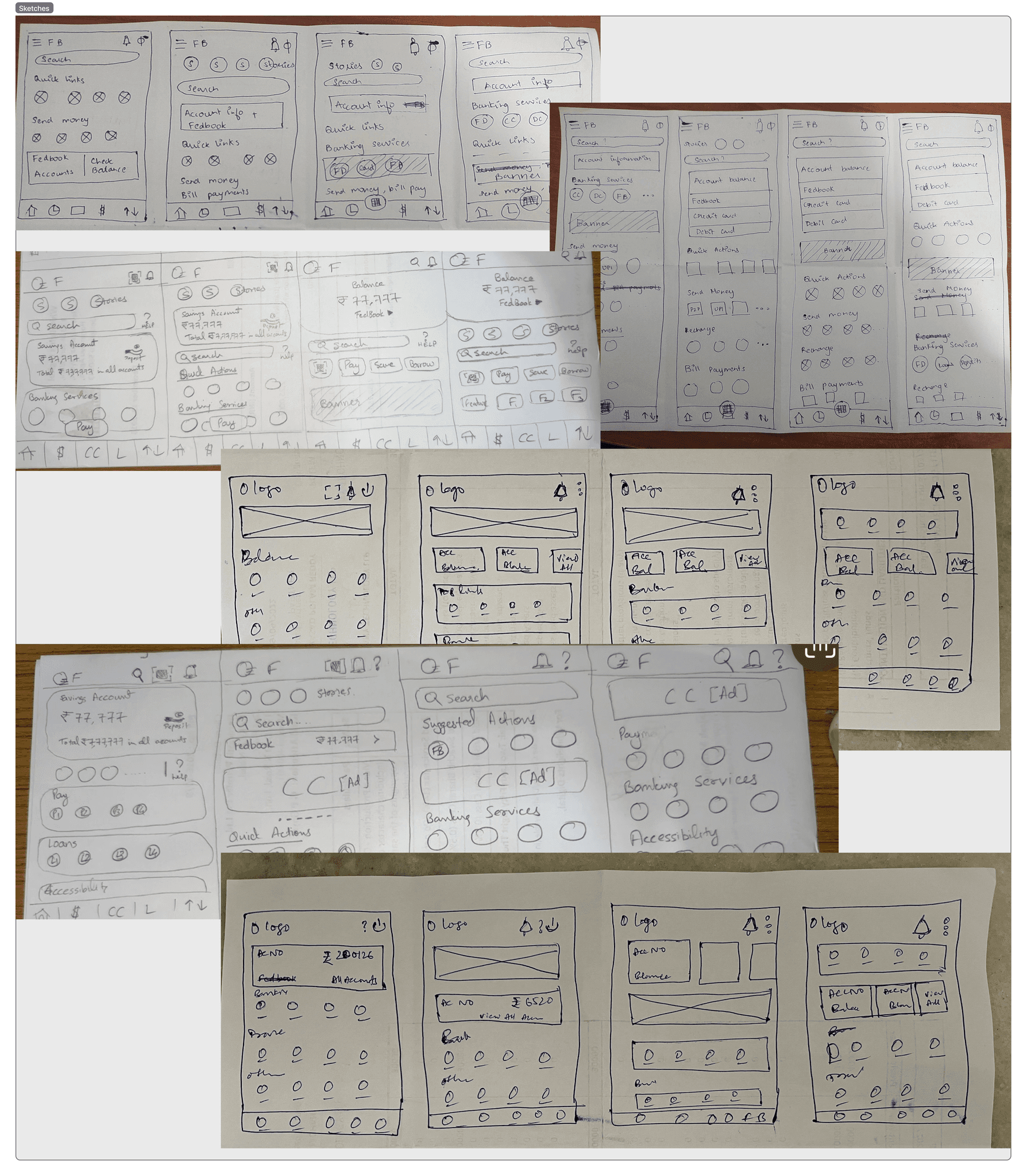
Why some iterations don't make sense
Why some iterations don't make sense
Many design iterations doesn't make sense because they prioritised visual over functional. This is a common outcome in sketching when designing complex financial interfaces. Key failures included:
Discarded designs that created cognitive overhead for users needing predictable banking access.
Radical information architecture doesn't sit well with different demographies.
Dynamic layouts lead to technical constraints and not possible given the bank's backend systems and regulatory requirements.
Designs working for tech-savvy users could create barriers for customers with limited smartphone experience.
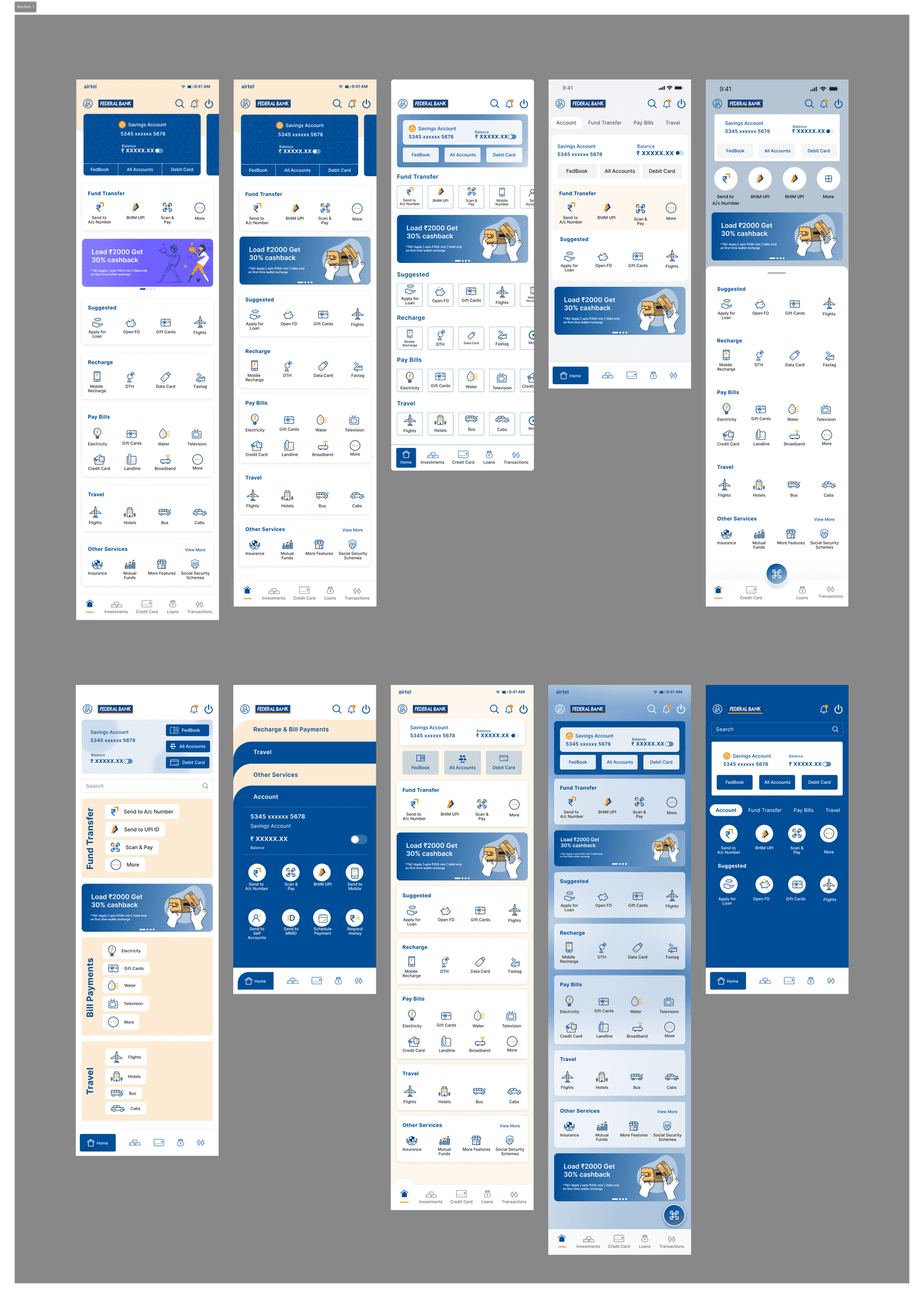
Initial Middish-high Designs
Initial Middish-high Designs
Initial designs were required to make sure the stakeholders are what to expect and make informed decisions about the home screen direction. Reason: Banking executives and PMs often struggle to envision final outcomes from rough sketches, especially when significant business investments are at stake.
Banking projects require extensive approval chains, variants helped stakeholders visualise different approaches before committing.
Each variant emphasised different business priorities like revenue generation, user engagement, operational efficiency.
High-fidelity designs revealed implementation complexities that sketches couldn't capture.
Executives could see how customer feedback translated into actual interface designs.
Conservative approaches that maintained familiar patterns while improving usability.
Revenue-focused layouts prioritizing banking services and cross-selling opportunities
User-centric versions emphasising search and customization capabilities.
These variants served as decision-making tools and allowed stakeholders to compare trade-offs.
To arrive at the ultimate solution, I developed:
10+ mid-fidelity designs
6+ UI-related modifications
15 account cards
8 styles of micro-interactions
2 app prototypes
To arrive at the ultimate solution, I developed:
10+ mid-fidelity designs
6+ UI-related modifications
15 account cards
8 styles of micro-interactions
2 app prototypes
Solution
Solution
1. Discoverability
a. Search functionality
The overwhelming number availability of modules in FedMobile poses challenges for users to discover what they need, as few modules are easy to find while others are part of the parent category, and navigating such modules is a tough ask for any user. In the old version, there is no search functionality. Hence it led to more dissatisfaction for the user when they want to find one.
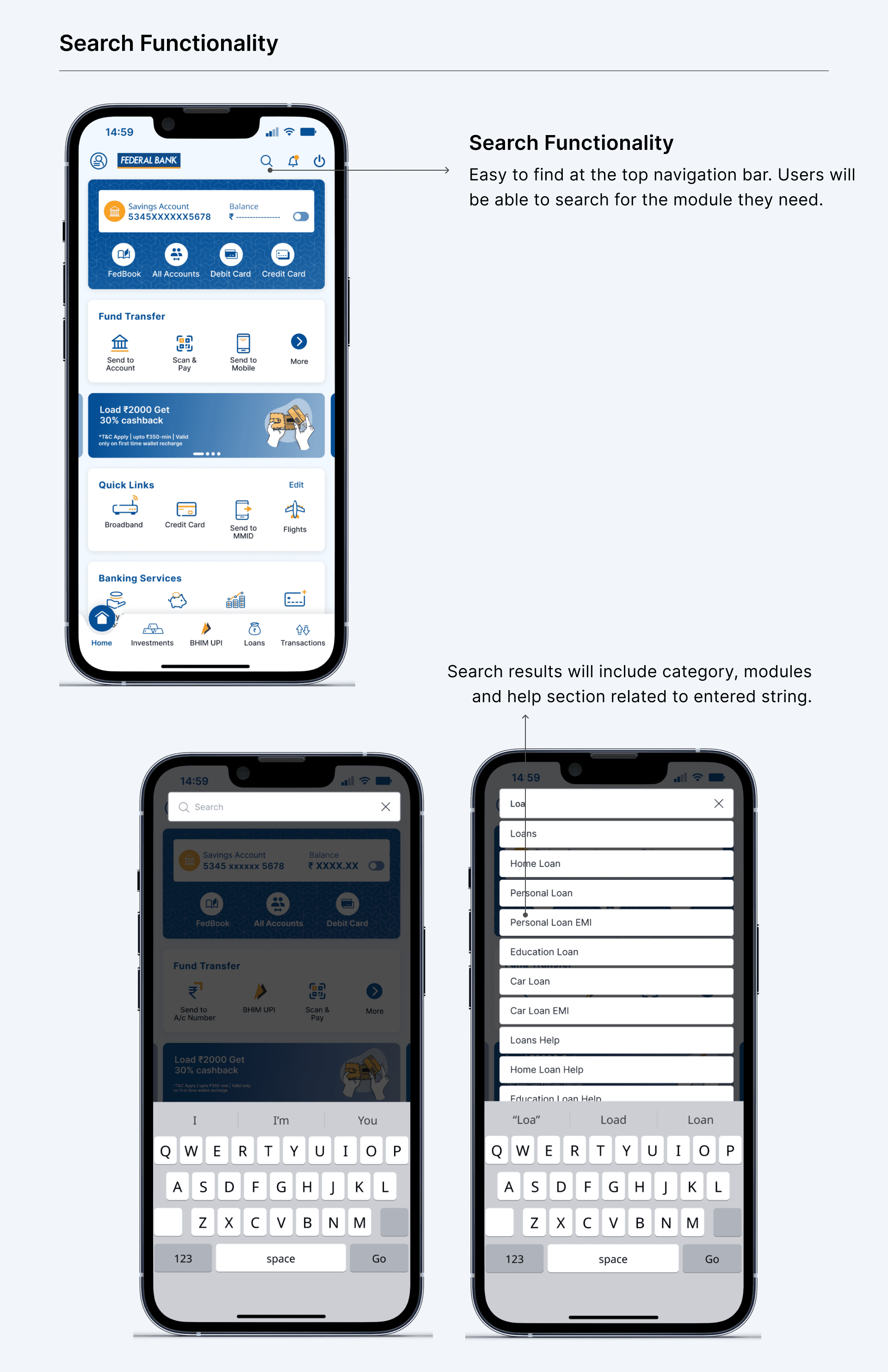
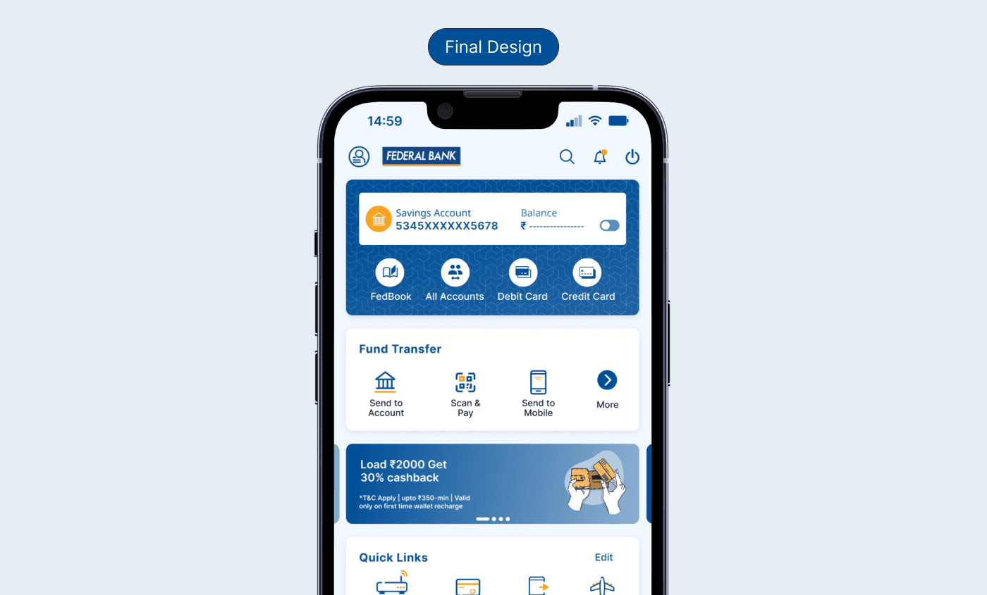
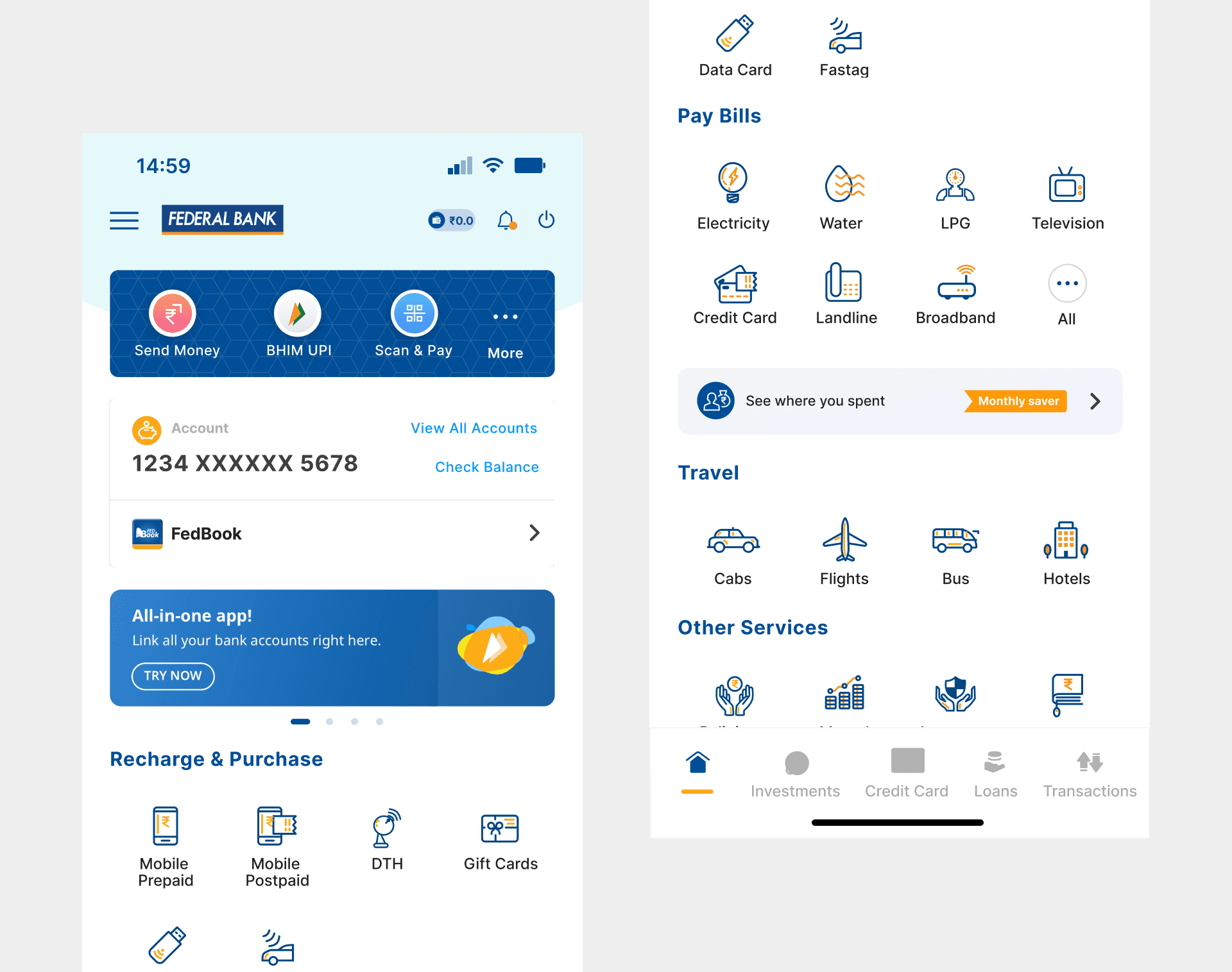
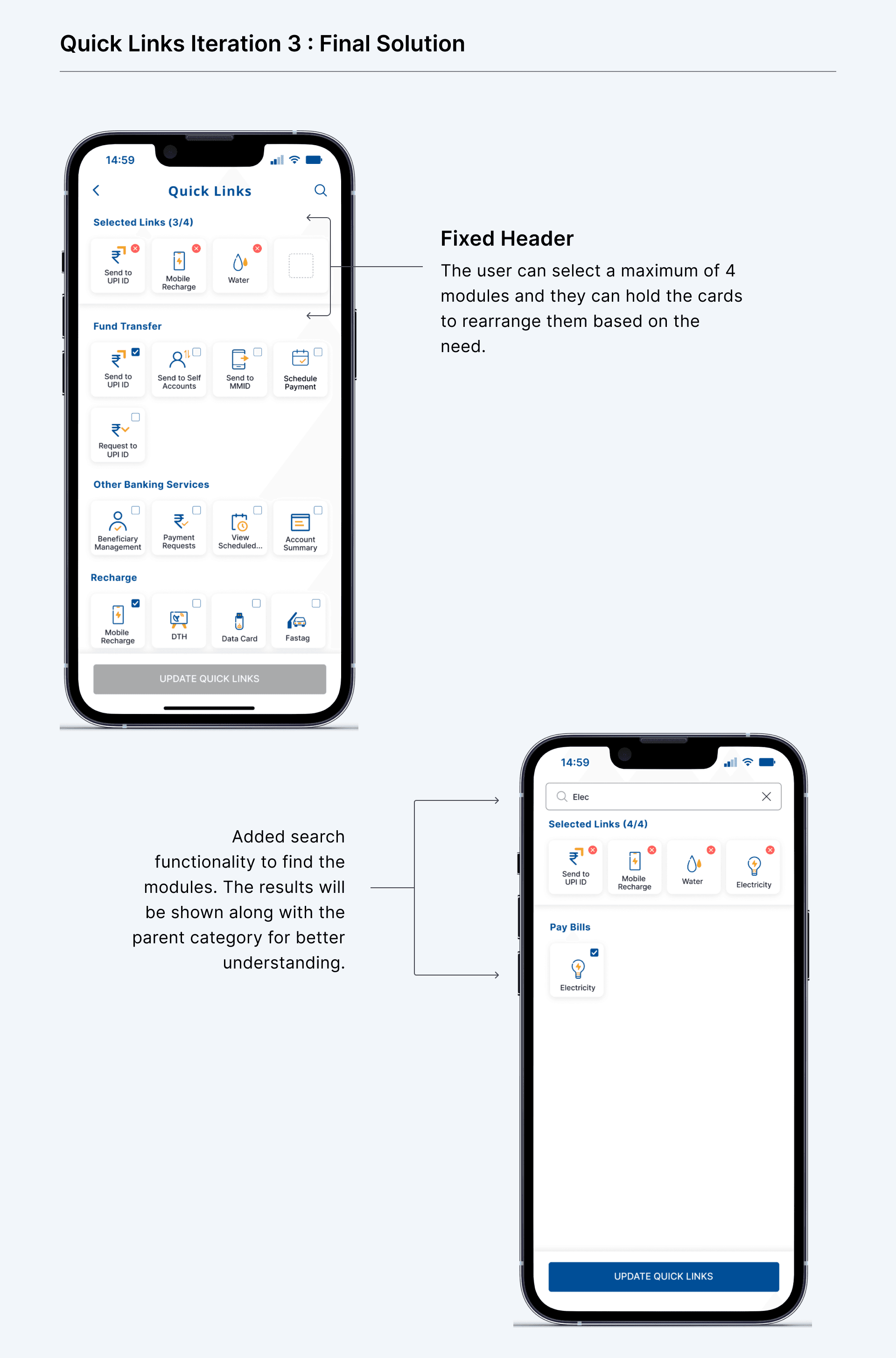
In the new design, I have added a Search option on the top navigation bar which allows users to initiate a search function. Why in top navigation? It is easy to find and using an icon makes it obvious. The search results will include categories, modules, and a help section related to entered string. Clicking on any of the menu options will redirect the user to the respective module's landing screen, providing a seamless navigation experience.
In the new design, I have added a Search option on the top navigation bar which allows users to initiate a search function. Why in top navigation? It is easy to find and using an icon makes it obvious. The search results will include categories, modules, and a help section related to entered string. Clicking on any of the menu options will redirect the user to the respective module's landing screen, providing a seamless navigation experience.
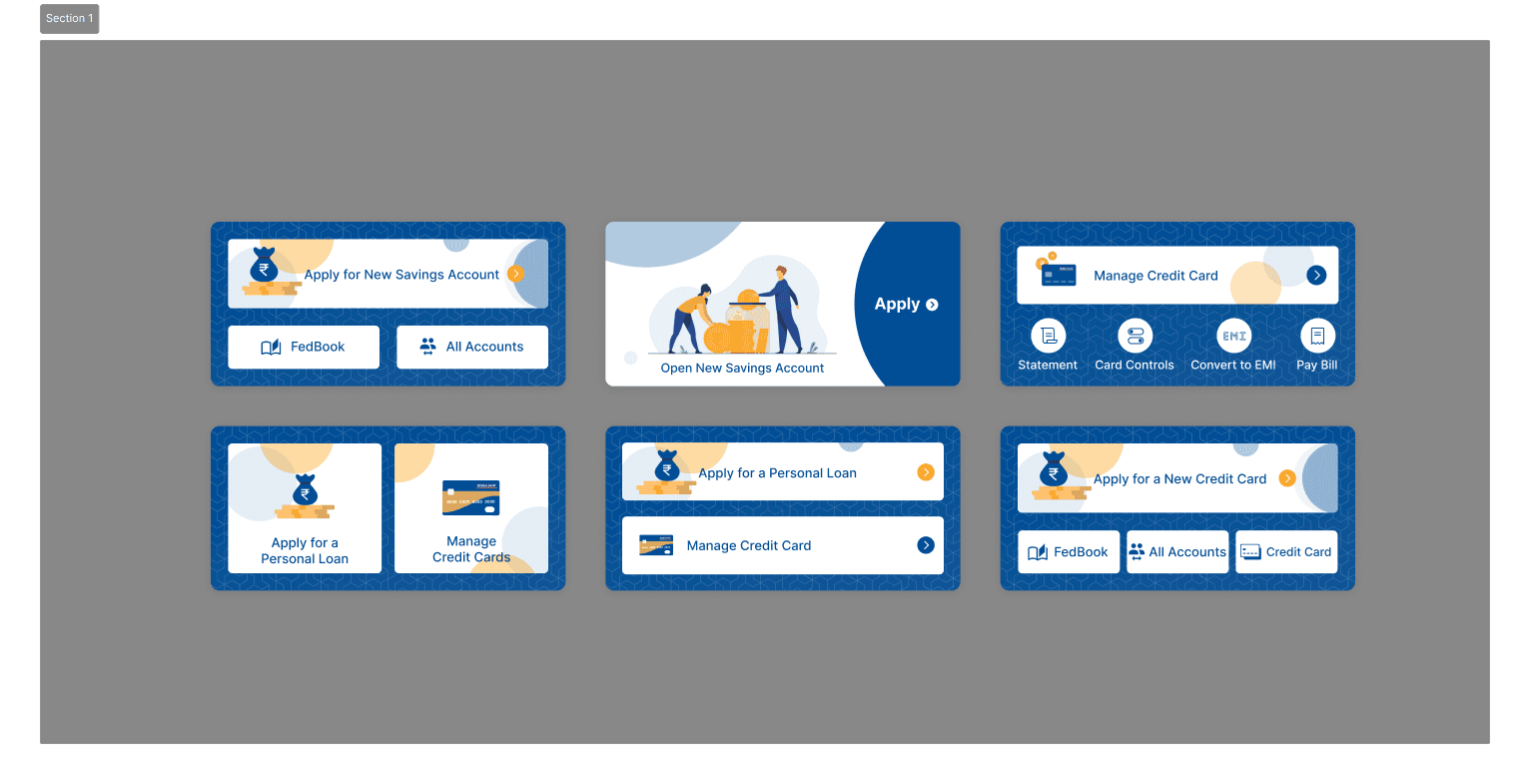
b. Banking Services
Every bank customer needs banking services whether it be loans, fixed deposits, or fund transfers, among others. We are losing an opportunity to showcase the banking modules to the users. In the old design, we don’t have a separate card for banking services.
b. Banking Services
Every bank customer needs banking services whether it be loans, fixed deposits, or fund transfers, among others. We are losing an opportunity to showcase the banking modules to the users. In the old design, we don’t have a separate card for banking services.
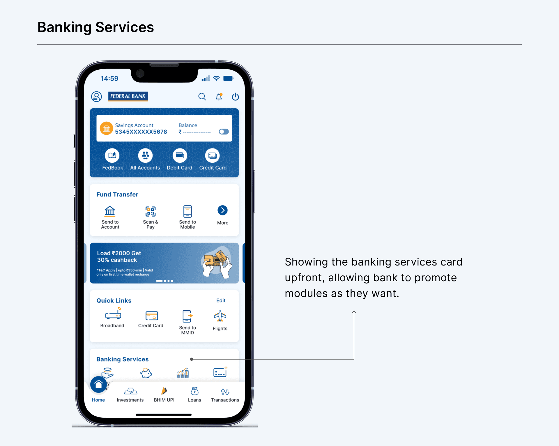
In the new design I have added a separate card for banking services and the modules are backend configured, thus helping banks to push the modules as they wish. Showing them upfront increases better visibility and engagement and in return it helps the bank to generate revenue.
In the new design I have added a separate card for banking services and the modules are backend configured, thus helping banks to push the modules as they wish. Showing them upfront increases better visibility and engagement and in return it helps the bank to generate revenue.
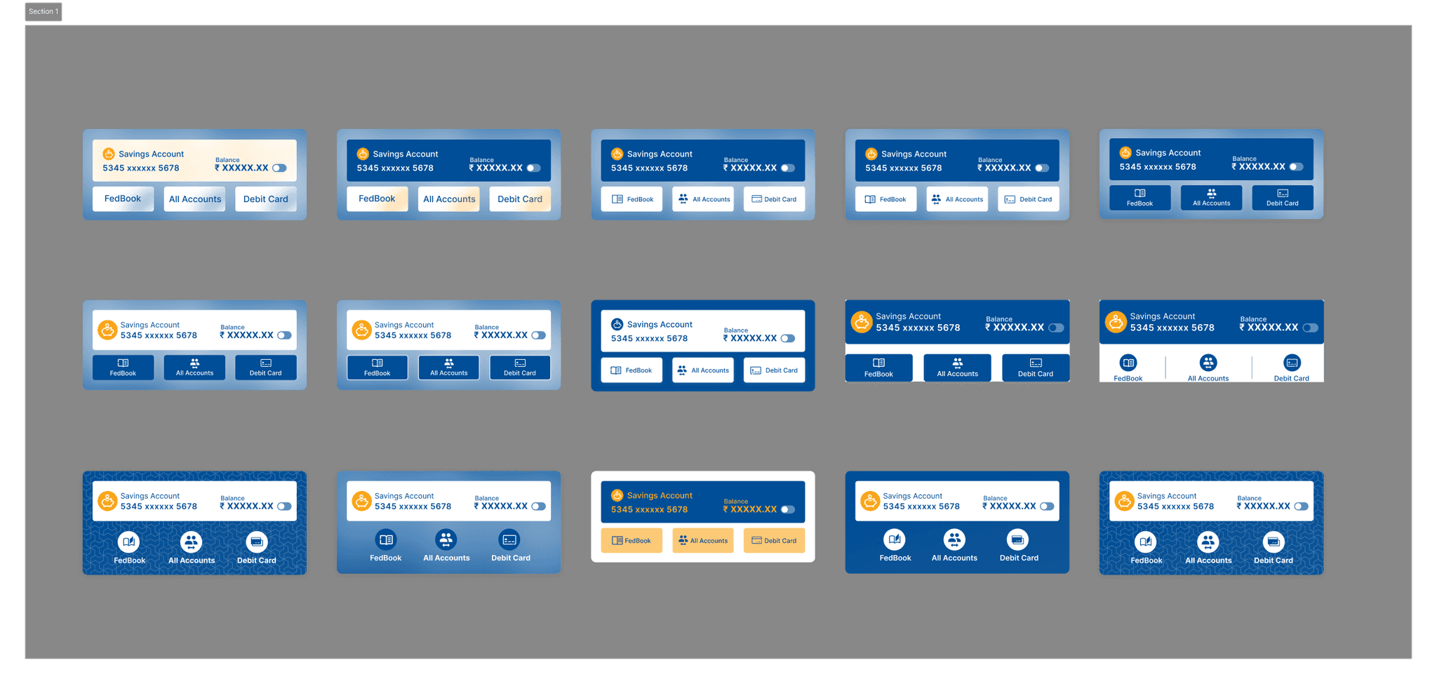
c. Account Card
Account card has been the primary component but it doesn’t look like one. It includes actions to allow users to check their balance, go to FedBook, view all accounts, and also know the type of account they hold. In the old, design there has been inconsistency, the CTAs of “Check Balance” and “View All Accounts” seems the same, while functionality has been different. While “Check Balance” shows the balance itself on the card while “View All Accounts” takes the user to the all accounts page.
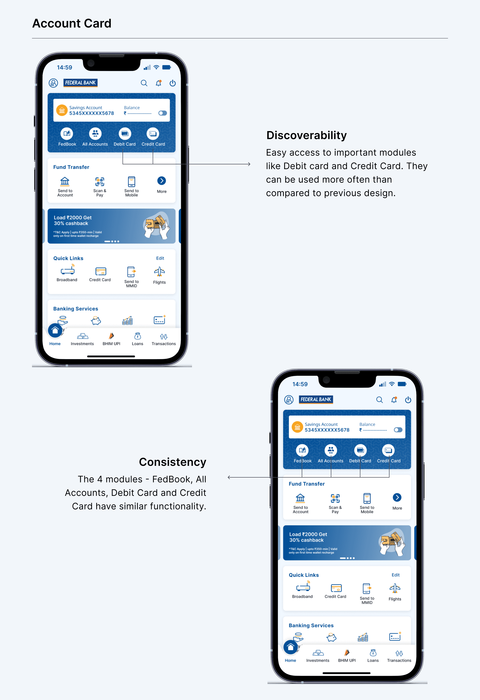
In the new design, the Account Card has been designed to stand out, out while containing the earlier-mentioned elements. Added icons to the modules which will help in better visibility and identification. I went ahead by adding entry points for a couple of modules -
1. Debit Card, which is earlier in the Hamburger menu. The Debit Card is an important module for any account holder. It made no sense to keep it inside the Hamburger menu, making discoverability hard. Now, in the new design users can access it easily for their needs for limit enhancement, pin change, and block card, among others.
2. Credit Card, which was in the bottom navigation bar. When tapped on the Credit card module, it takes the user to an SDK, where there is no bottom Nav bar. Again, it creates inconsistency. By placing on the account card it has been emphasised along with other modules in the account card.
The 4 modules - FedBook, All Accounts, Debit Card, and Credit Card have similar functionality.
d. Prioritisation of modules
There are a number of modules available on the Home Screen for a user. When the old design was made not sure, which module was more often used than others. But now we have data that shows the most used modules, which includes modules from within the parent category.
d. Prioritisation of modules
There are a number of modules available on the Home Screen for a user. When the old design was made not sure, which module was more often used than others. But now we have data that shows the most used modules, which includes modules from within the parent category.
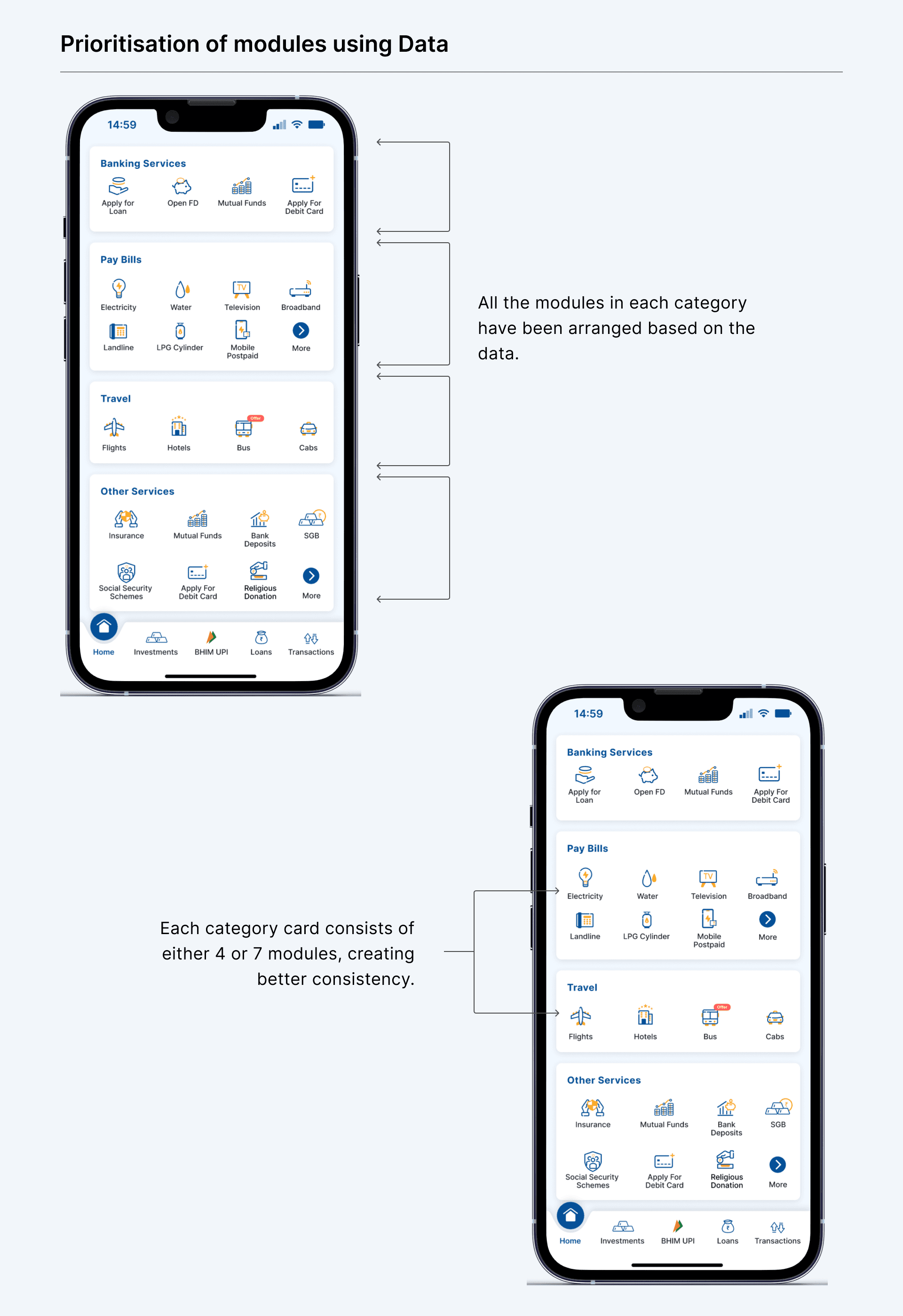
In the new design, all the modules have been organised based on the engagement data which we have been tracking. By adding modules that were difficult to navigate but most often used, will help users to access them more easily and with less friction. And also the decision to accommodate either 4 or 7 modules at a time will allow to create better consistency.
In the new design, all the modules have been organised based on the engagement data which we have been tracking. By adding modules that were difficult to navigate but most often used, will help users to access them more easily and with less friction. And also the decision to accommodate either 4 or 7 modules at a time will allow to create better consistency.
2. Customisation and Promotion
We want to allow users to customise modules based on their needs. In addition to customisation we want to allow banks to promote any particular module for the users.
a. Most Recently Used (MRUs) converted to Quick Links after feedback
Initially, I designed a section called "Your Activity" that automatically displayed modules and features users had recently accessed. My assumption was that users would likely reuse their last actions, creating a dynamic backlog where they could find previous activities by viewing the complete list. However, user feedback revealed this approach wasn't meeting their needs, they found the automatic curation impersonal and unpredictable.
Why MRUs Failed:
Users wanted control over what appeared in prominent positions.
Automatic suggestions felt impersonal rather than helpful.
Recent activity didn't always reflect their most important tasks.
Users couldn't predict what would appear in this section.
Evolution to Quick Links:
Based on this feedback, I pivoted to a more user-centric approach. I suggested allowing users to manually choose from all available modules and make them accessible via single tap. Users immediately connected with this idea of personal curation rather than algorithmic suggestions.
Final Quick Links Solution:
A dedicated card with 4 customizable modules was added to the new design, including all parent modules offered by FedMobile. Users can add, remove, or rearrange modules within the card, giving them complete control over their most accessible banking functions. This change transformed a potentially frustrating automated feature into an empowering customization tool that respected user preferences and usage patterns.
These are some of the iterations I tried to solve for this problem —
Iteration 1 : Individual Cards
In this iteration, the selected cards are assigned a number. But there were two issues:
1. Not getting a clear picture of what cards are selected and on what priority.
2. When a 5th card is selected, what should happen? Whether it should be First in First out or First in Last out.
2. Customisation and Promotion
We want to allow users to customise modules based on their needs. In addition to customisation we want to allow banks to promote any particular module for the users.
a. Most Recently Used (MRUs) converted to Quick Links after feedback
Initially, I designed a section called "Your Activity" that automatically displayed modules and features users had recently accessed. My assumption was that users would likely reuse their last actions, creating a dynamic backlog where they could find previous activities by viewing the complete list. However, user feedback revealed this approach wasn't meeting their needs, they found the automatic curation impersonal and unpredictable.
Why MRUs Failed:
Users wanted control over what appeared in prominent positions.
Automatic suggestions felt impersonal rather than helpful.
Recent activity didn't always reflect their most important tasks.
Users couldn't predict what would appear in this section.
Evolution to Quick Links:
Based on this feedback, I pivoted to a more user-centric approach. I suggested allowing users to manually choose from all available modules and make them accessible via single tap. Users immediately connected with this idea of personal curation rather than algorithmic suggestions.
Final Quick Links Solution:
A dedicated card with 4 customizable modules was added to the new design, including all parent modules offered by FedMobile. Users can add, remove, or rearrange modules within the card, giving them complete control over their most accessible banking functions. This change transformed a potentially frustrating automated feature into an empowering customization tool that respected user preferences and usage patterns.
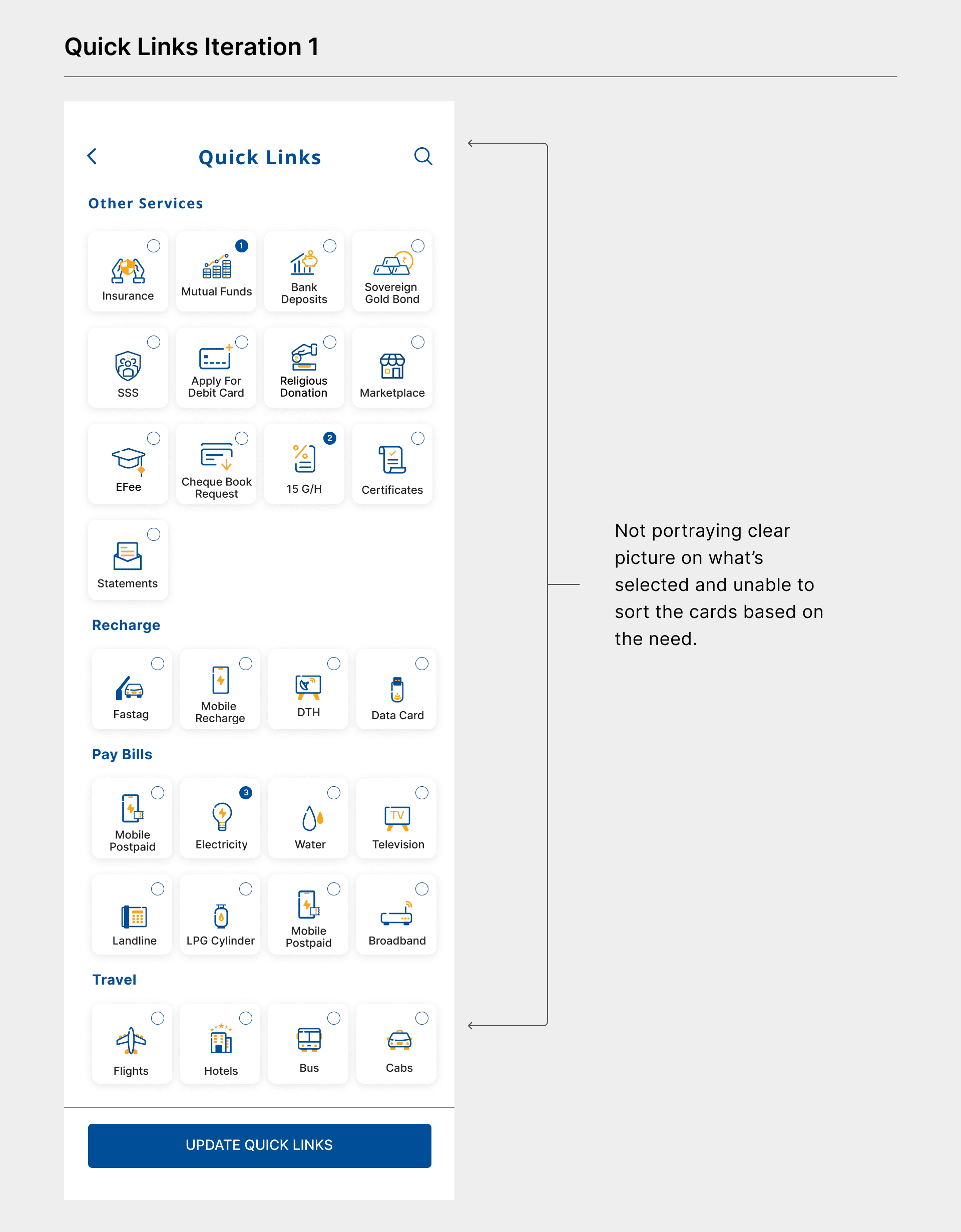
These are some of the iterations I tried to solve for this problem —
Iteration 1 : Individual Cards
In this iteration, the selected cards are assigned a number. But there were two issues:
1. Not getting a clear picture of what cards are selected and on what priority.
2. When a 5th card is selected, what should happen? Whether it should be First in First out or First in Last out.
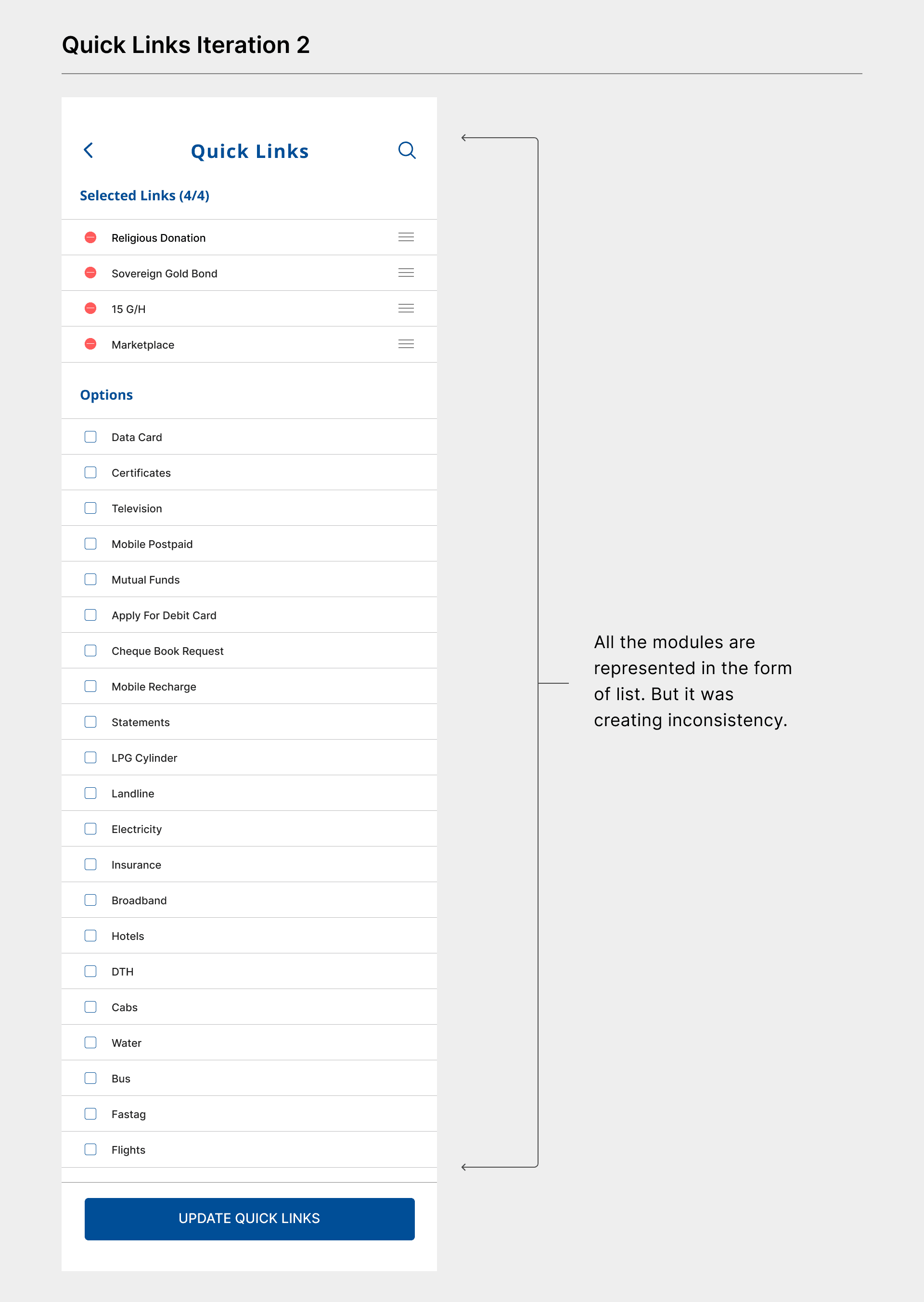
Iteration 2 : List
In this iteration, all the modules are represented in the form of list items. Users can select as many options as they want but they have to keep only 4 options else they won’t be able to proceed save. Additional option to sort the list items. I found one problem with the design, it is kind of inconsistency because we were using Cards and now this is a list.
Iteration 3 : Cards with fixed header (Final)
Added a fixed header to show the selected options along with the count, to iteration 1. The user can rearrange the options as needed. This clearly portrays what's being selected and in which order. This gives better customisation flexibility for the users.
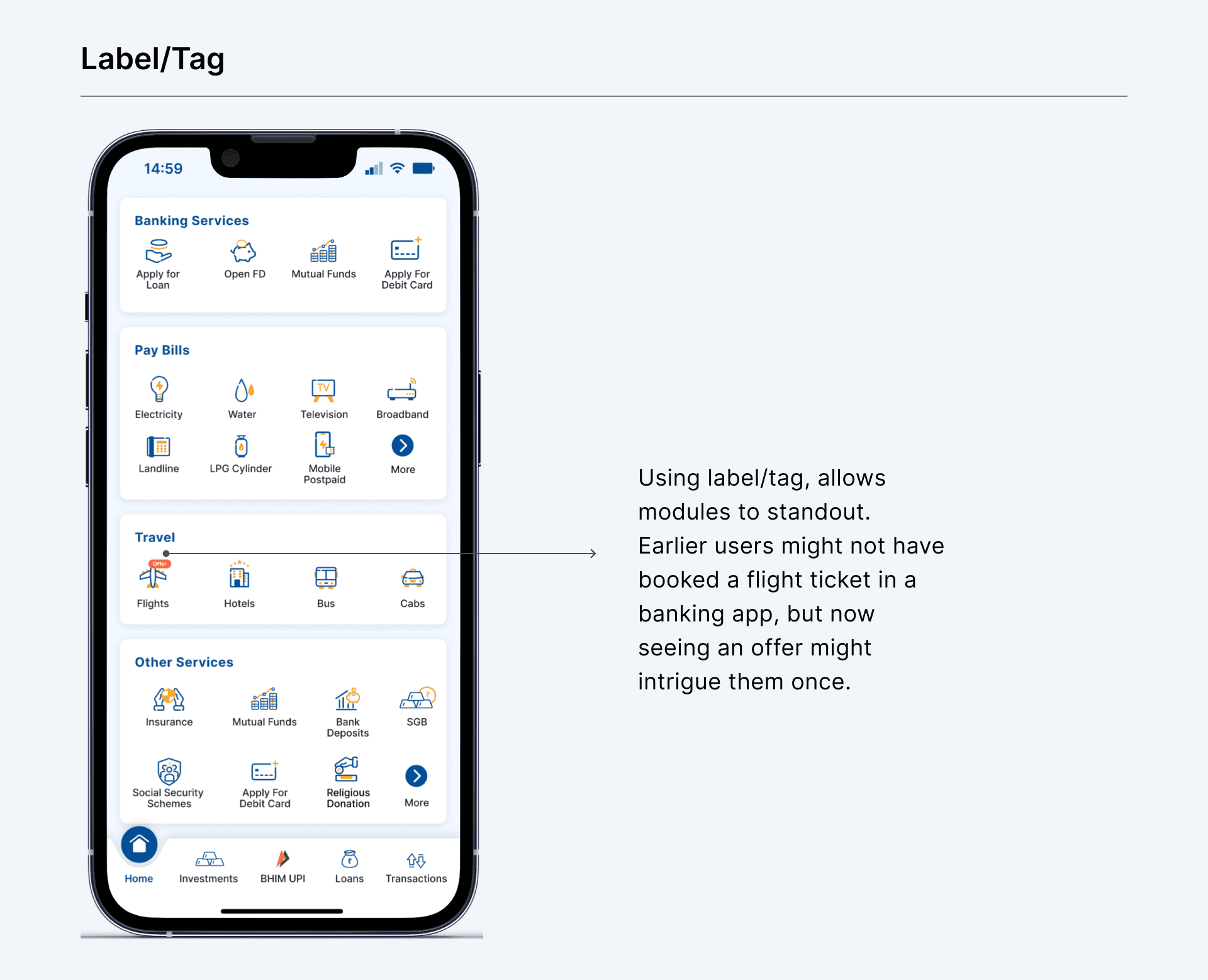
b. Label/Tag for highlighting
In the old design, there is no option to promote any particular module. This creates a gap between banks and users. The bank wants to promote a few modules but they can’t efficiently convey them. Banners might work but users generally miss out. Adding a label/tag on each module which the bank wants the user to interact with create differentiation. This allows users to engage with the rest of the modules which they generally don’t use and provides an opportunity for the users to see what offers are being rolled out for them.
3.Additional Changes
Even though we have achieved our objectives to better discoverability, customisation among others. I went ahead and added few changes which I felt will enhance the visual experience. This will give a refreshed feel to the new design compared to the old design.
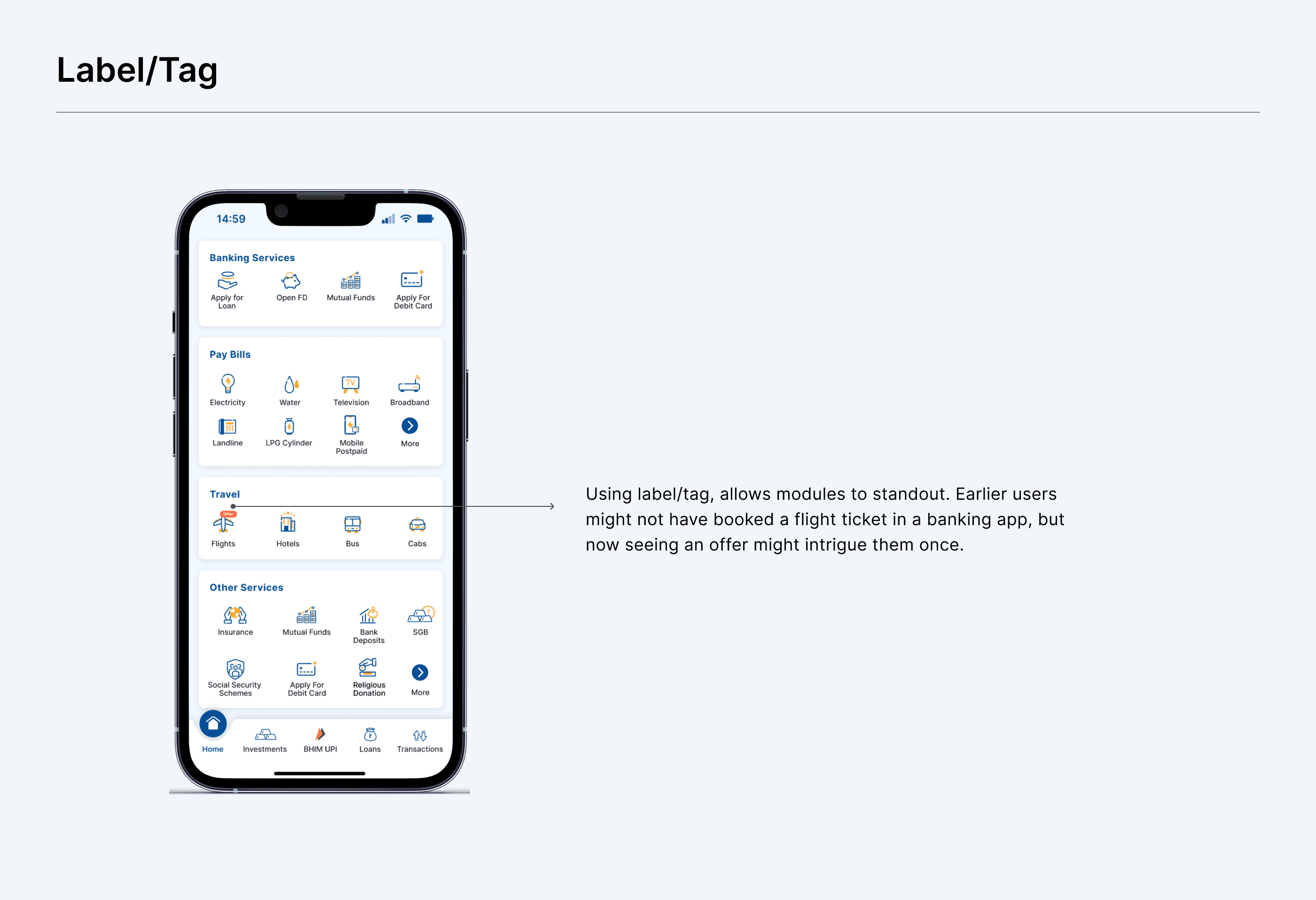
a. Updated Icons
The new icons for each modules has been redesigned with a new design pattern, thus allowing to user to feel an upgrade to the old design. The new icons have better relatedness, clarity and consistency.
3.Additional Changes
Even though we have achieved our objectives to better discoverability, customisation among others. I went ahead and added few changes which I felt will enhance the visual experience. This will give a refreshed feel to the new design compared to the old design.
a. Updated Icons
The new icons for each modules has been redesigned with a new design pattern, thus allowing to user to feel an upgrade to the old design. The new icons have better relatedness, clarity and consistency.
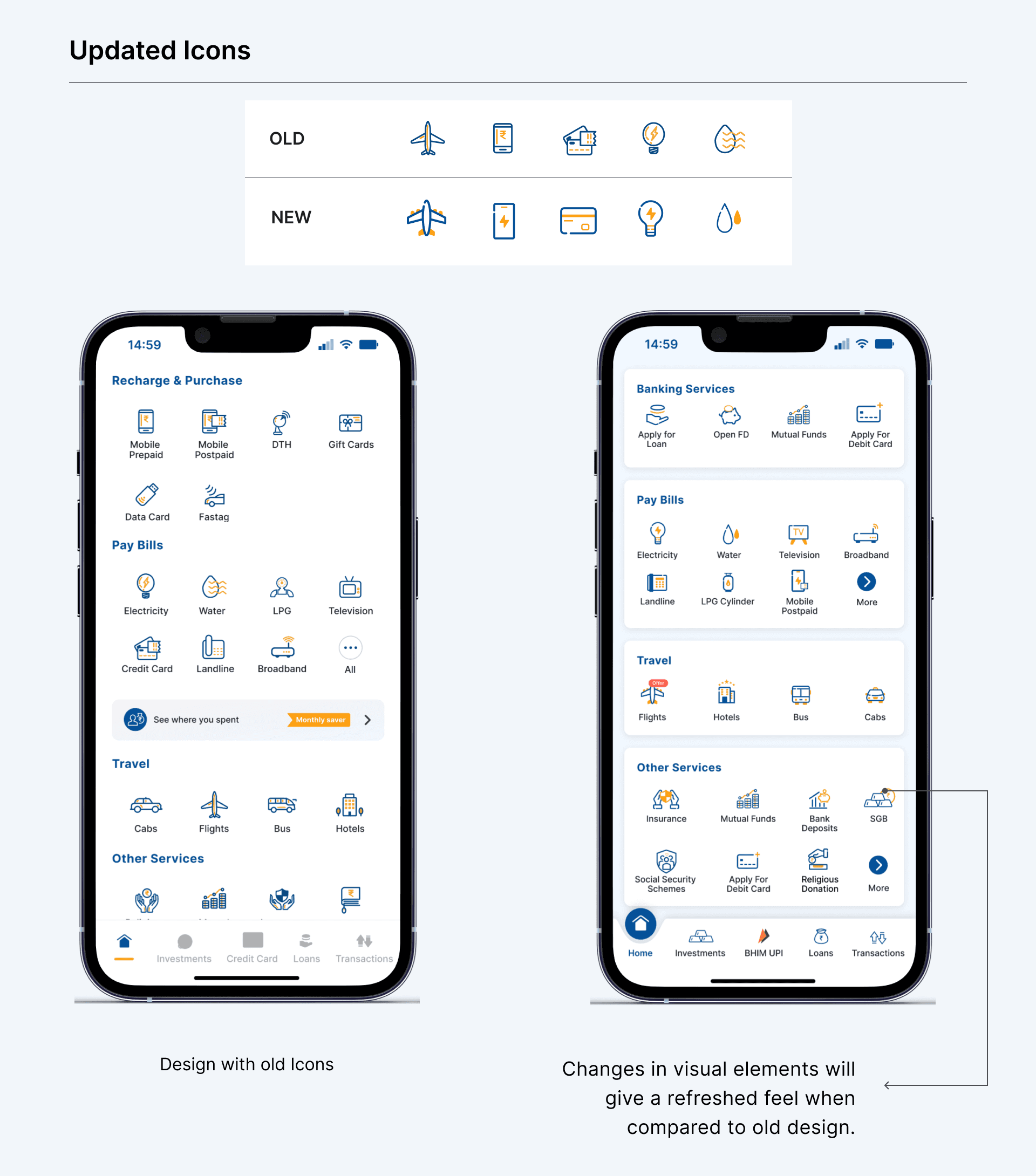
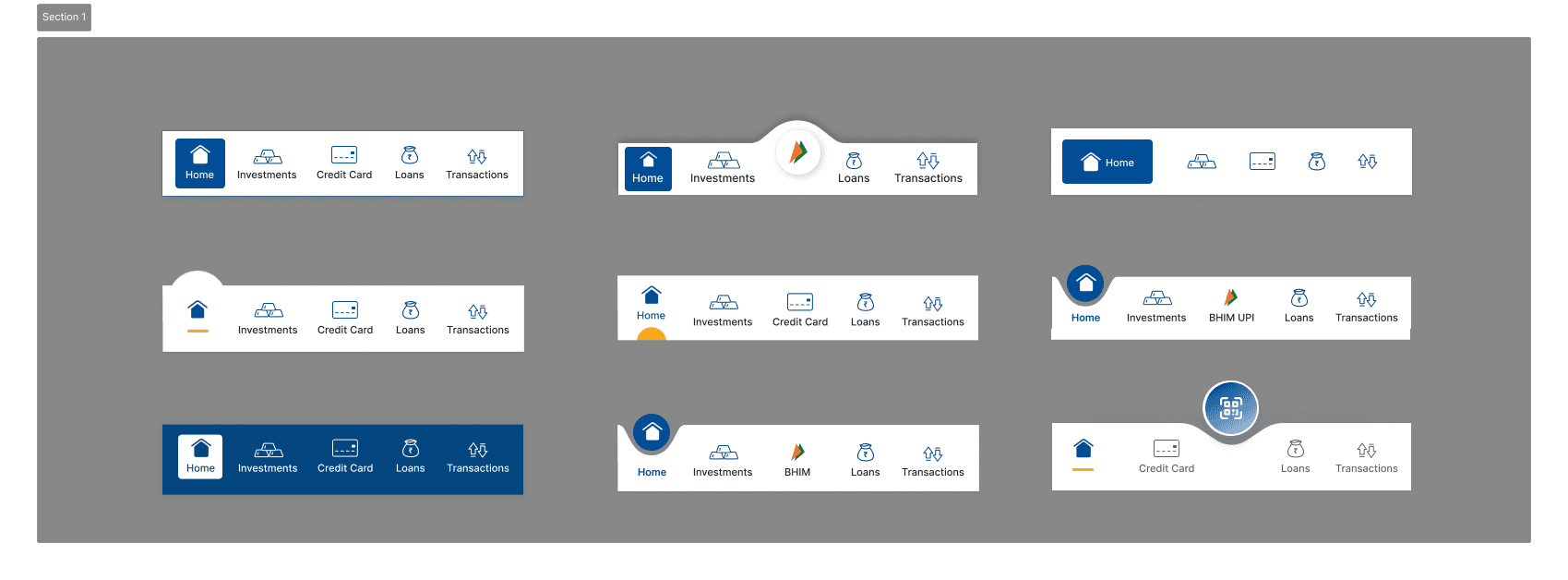
b. Updated NavBar
The bottom Navigation Bar, in the old design, felt unaligned with the rest of the design. There were no micro-interactions. The updated NavBar has new icons and micro-interactions, thus providing better acknowledgment to user actions.
b. Updated NavBar
The bottom Navigation Bar, in the old design, felt unaligned with the rest of the design. There were no micro-interactions. The updated NavBar has new icons and micro-interactions, thus providing better acknowledgment to user actions.
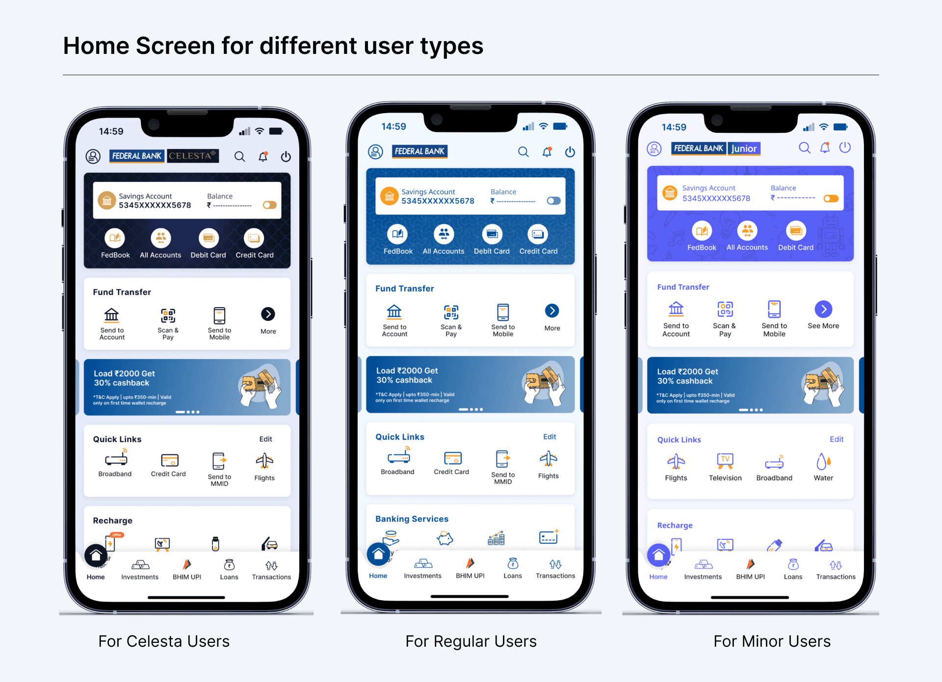
Designs for Celesta and Minor
FedMobile is being used by three primary types of users:
1. Regular users - the largest base,
2. Minors - Under-18 accounts and
3. Celesta - Premium users.
Even the core of the FedMobile remains for everyone, but the color palettes are different for each user type. With the new design being shipped out, it is essential to update for the other 2 user types as well.
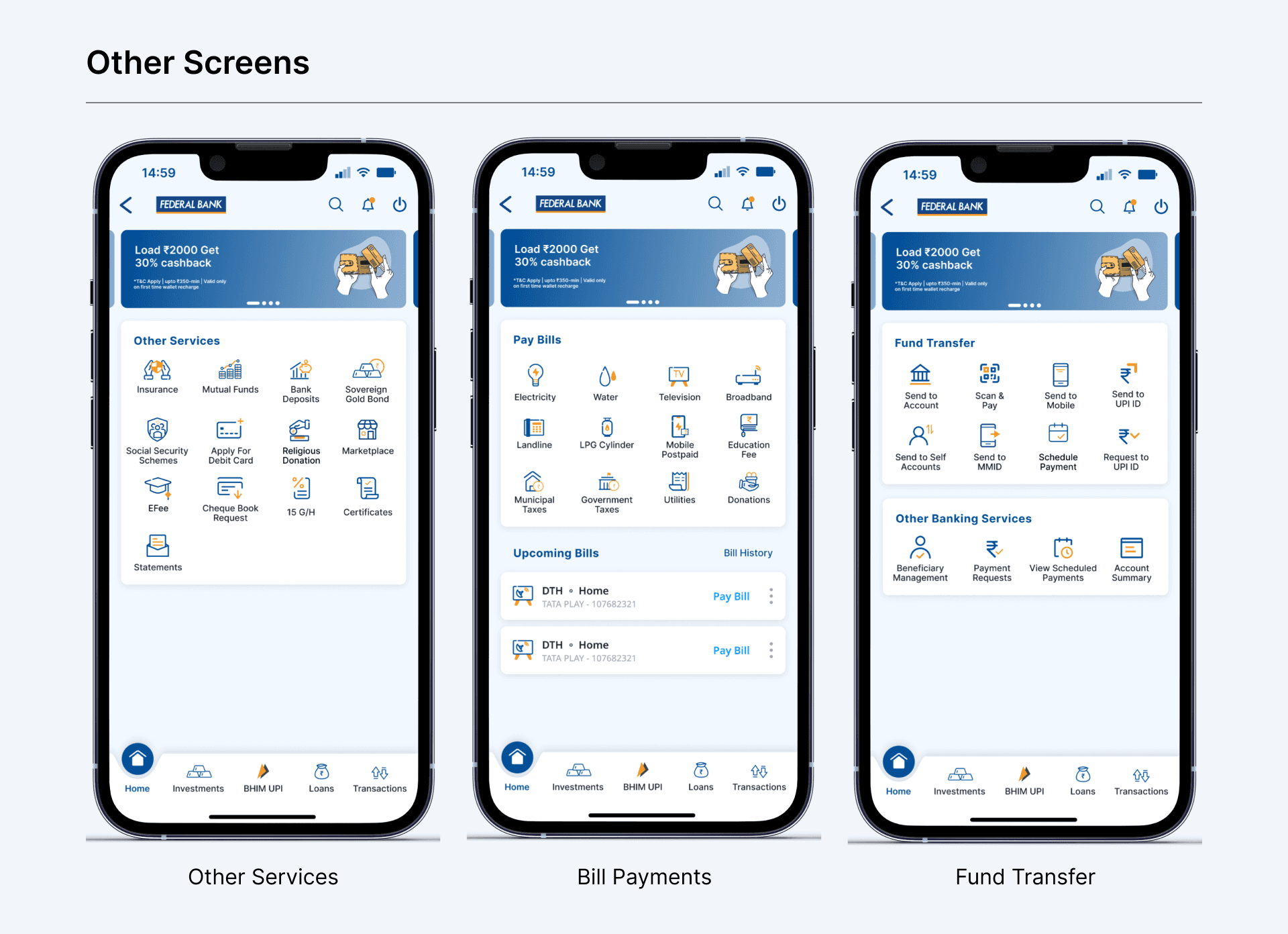
Changes of subsequent screens
There are subsequent screens which can be navigated to, for other modules. To maintain the consistency it is very important revamp the screens and eventually enhance the user experience when compared to the previous design. The redesign features are sorted based on the data. New modules have been added to Other services taking the tally to 13 when compared to 6 in previous design. This action is taken to improve better discoverability.
Accessibility Improvements
Accessibility Improvements
I prioritized accessibility improvements throughout the redesign to ensure Federal Bank's diverse user base could navigate effectively. The banking app serves customers with varying digital literacy levels and physical capabilities, making inclusive design essential for business success. Key improvements included:
Enhanced color contrast: Met WCAG AA standards for text overlays and module backgrounds.
Increased icon sizes: 16% larger touch targets for easier interaction.
Intuitive iconography: Replaced abstract symbols with recognizable icons.
Expanded touch areas: Minimum 44px targets for users with motor difficulties.
Consistent visual hierarchy: Clear typography scaling and spacing for cognitive accessibility.
Design Handoff
Design Handoff
Created comprehensive documentation to ensure seamless implementation of the home screen redesign and also setting base for upcoming design changes in other modules and design components to be followed. Documentation included:
Component specifications: Exact measurements, spacing, and interaction states.
Organised asset libraries: Clear naming conventions by module type.
User flow diagrams: Navigation paths and state changes for new features.
Micro-interactions and transition details.
Cross-functional Partnership
Cross-functional Partnership
Worked extensively across teams to ensure design success and smooth implementation. This required alignment between multiple stakeholders with different priorities and technical constraints. Key partnerships:
Product Managers & Bank Stakeholders: Aligned module prioritization with business metrics and revenue goals.
QA teams: Incorporated feedback on edge cases, error states, and loading behaviors.
Engineering team: Assessed technical feasibility and optimized asset delivery.
Design system support: Created guidelines for new components and conducted implementation reviews. (Read the design system case study)
Outcomes
Outcomes
Improved discoverability through Search
The introduction of the Search function led to a noticeable rise in the number of sessions and feature access, showing that users could now locate specific modules faster and more efficiently.
Increased engagement with key modules
A structured and prioritized layout helped surface revenue-generating modules more effectively, resulting in higher interaction and engagement.
Growth in session duration
With clearer navigation and reduced friction, users spent more time exploring beyond their primary tasks — reflecting positively in time spent per session.
Better visibility for business-critical features
By solving discoverability challenges and customizing module order, we were able to reduce the difficulty in promoting important services.
Positive user feedback
Early qualitative feedback confirmed that users found the new layout easier to use and more helpful for completing tasks — building user trust and satisfaction.
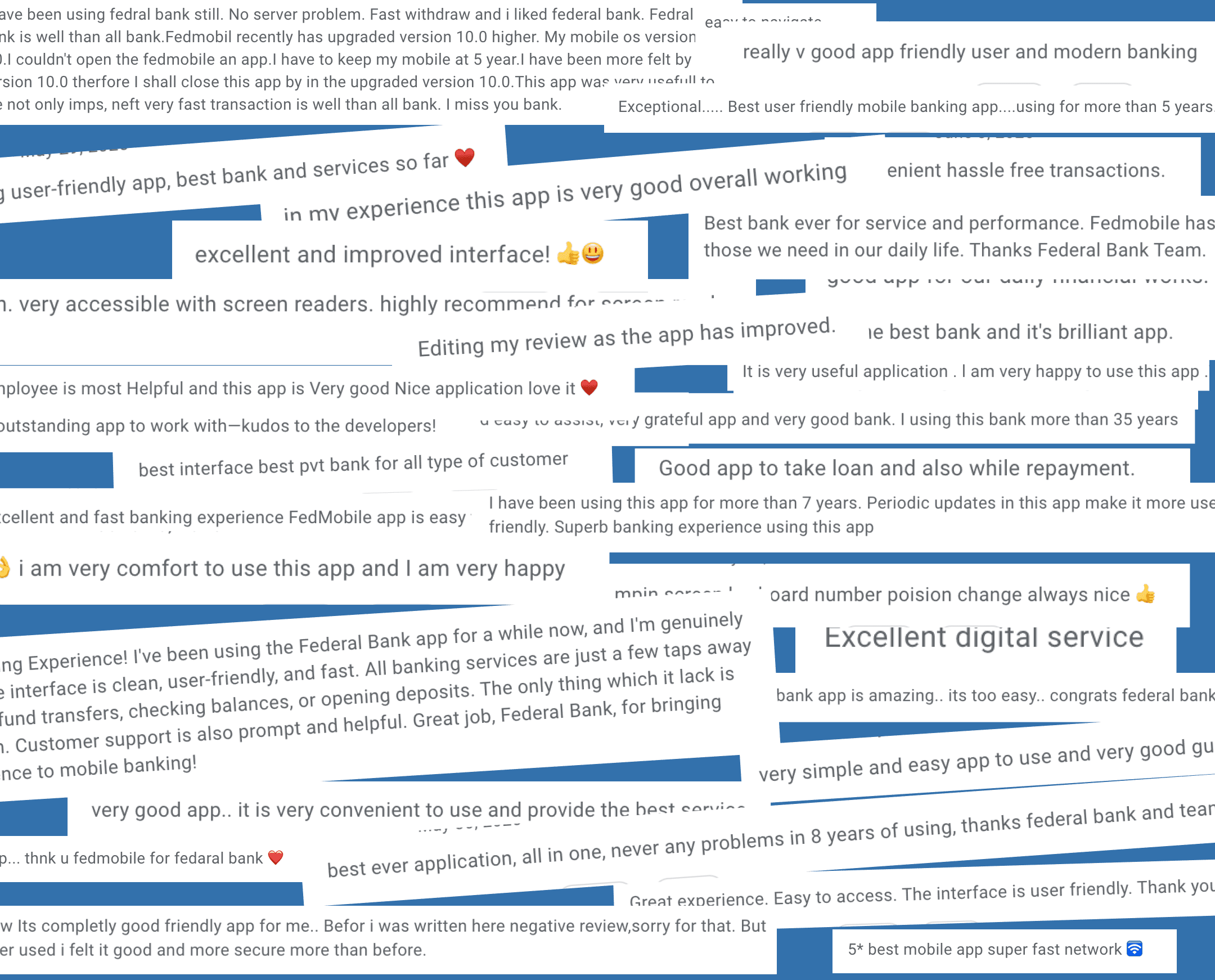
Positive Feedback from users
Positive Feedback from users
Summary
Summary
The FedMobile redesign addressed critical navigation and discoverability issues that were hindering user engagement and revenue generation. With customers struggling to find banking services, this project aimed to create a more intuitive and business-aligned experience. Project approach:
Problem identification: Poor module discoverability, unclear navigation, low engagement, lack of personalisation.
Research foundation: User interviews, CleverTap analytics, and competitive analysis.
Design process: Sketching, Mid-fidelities, high-fidelities.
Final solutions: Search functionality, customizable Quick Links, prioritized banking services.
Micro-interactions: Enhanced bottom navigation and visual feedback systems
Updated existing design system for scalability.
Business impact: 16% increase in repeated users, 28% adoption of search, better navigation, prioritisation of banking modules.
What's Next
What's Next
Building on this foundation, the next phase will focus on expanding the improved UX patterns across the entire app. The home screen success creates opportunities for broader digital banking transformation. Upcoming initiatives:
Mpin screen redesign: Integrate biometric login for seamless authentication.
Module consistency: Apply new design patterns to existing banking features.
Design system expansion: Ensure all new modules follow established guidelines.
Enhanced micro-interactions: Add delightful animations across user journeys.
Personalization engine: Leverage user data for smarter content recommendations.
What I could have done differently
What I could have done differently
Given another opportunity, I would expand the project scope and research depth to create an even more comprehensive solution. Some constraints limited our ability to gather deeper user insights. Future improvements:
Include Mpin redesign: Biometric login integration would set the tone for better overall UX.
Expanded user research: Conduct more interviews with proper permissions and fewer restrictions.
Broader usability testing: Test with more diverse user groups across different digital literacy levels.
Earlier technical consultation: Involve engineering teams sooner to avoid implementation constraints.
Long-term Product Impact
Long-term Product Impact
The redesigned home screen establishes a foundation for Federal Bank's digital transformation and customer experience evolution. This work extends far beyond visual improvements to create lasting business value.
Strategic benefits:
Inclusive accessibility: Design serves users across all demographics without feeling outdated.
Design system efficiency: Updated components enable faster future development.
Brand value enhancement: Better experiences reduce complaints and increase customer satisfaction.
Business control: Dynamic content management allows targeted service promotion.
Scalable architecture: Modular design supports future feature additions and market expansion.
Learnings
Learnings
This project taught me valuable lessons about designing for diverse user bases and managing complex stakeholder expectations. Banking UX requires balancing innovation with accessibility and business constraints.
Key insights:
Customer diversity reality: Can't please everyone, tradeoffs are necessary when serving varied user needs.
Scope clarity importance: Setting clear boundaries and objectives prevents feature creep.
Data-driven decisions: Analytics provide more reliable insights about user behavior.
Intution helps to create something for users but acting on actual feedback and converting the intution to a solution leads to user satisfaction and achiveing user goals.