Enabled 20% Faster Design with a Scalable and Unified Design System - Federal Bank India
Let me take you through my process of upgrading FedMobile Design System
My Role in the Project
As the Product Designer, I was responsible for enhancing the FedMobile app experience by ensuring visual and functional consistency across modules. My role included:
Identifying Design Issues: I analyzed existing inconsistencies and usability challenges.
Collaborating Across Teams: I worked closely with developers and the product manager to ensure seamless integration, aligning design decisions with user needs and business goals.
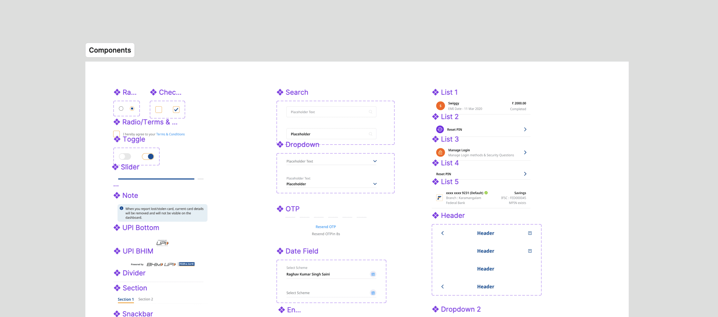
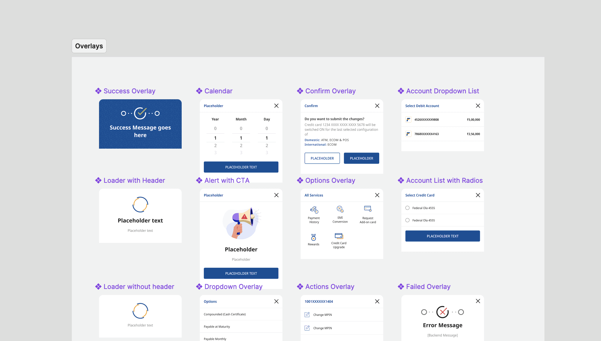
Creating Reusable Components: I designed scalable and accessible components.
Documentation: I created detailed guidelines for the effective use of the design system.
Understanding the Problem Space
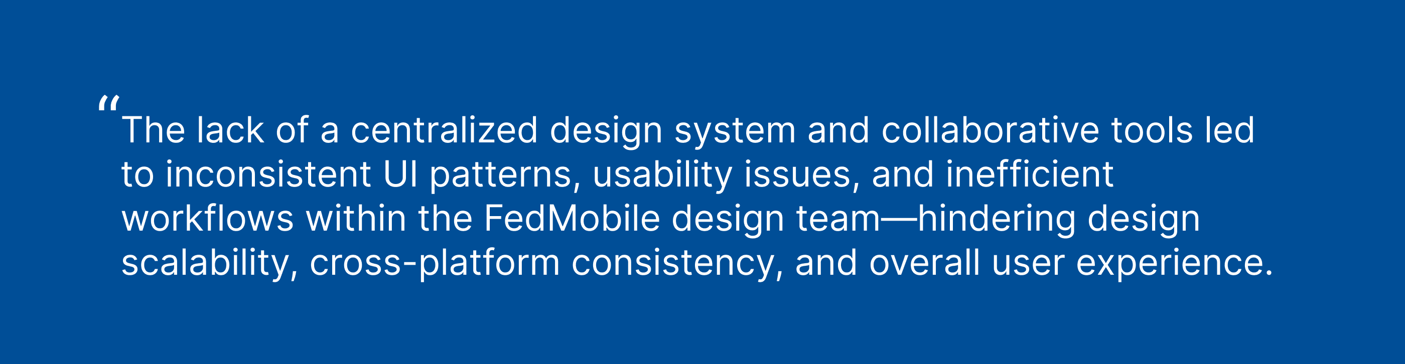
Before I joined the project, FedMobile’s design team was working in silos using Sketch, which lacked online collaboration tools. This resulted in inefficiencies such as manual file updates and misaligned designs. There was no central design system, leading to:
Inconsistencies: Variations in button styles, typography, and spacing across different screens.
Usability Challenges: Disconnected experiences and design inconsistencies that affected the user journey.
Scalability Issues: Difficulty in adapting designs across multiple screen sizes and platforms (Android vs. iOS).
Probelm Statement
Metrics Analysis
To ensure the design system would lead to measurable improvements, I focused on these key metrics:
Design Time Reduction: Faster feature implementation due to reusable components.
Improved User Satisfaction: Enhanced consistency would lead to better user experiences.
Scalability: Ensuring the system could grow and adapt to future devices and user needs with minimal effort.
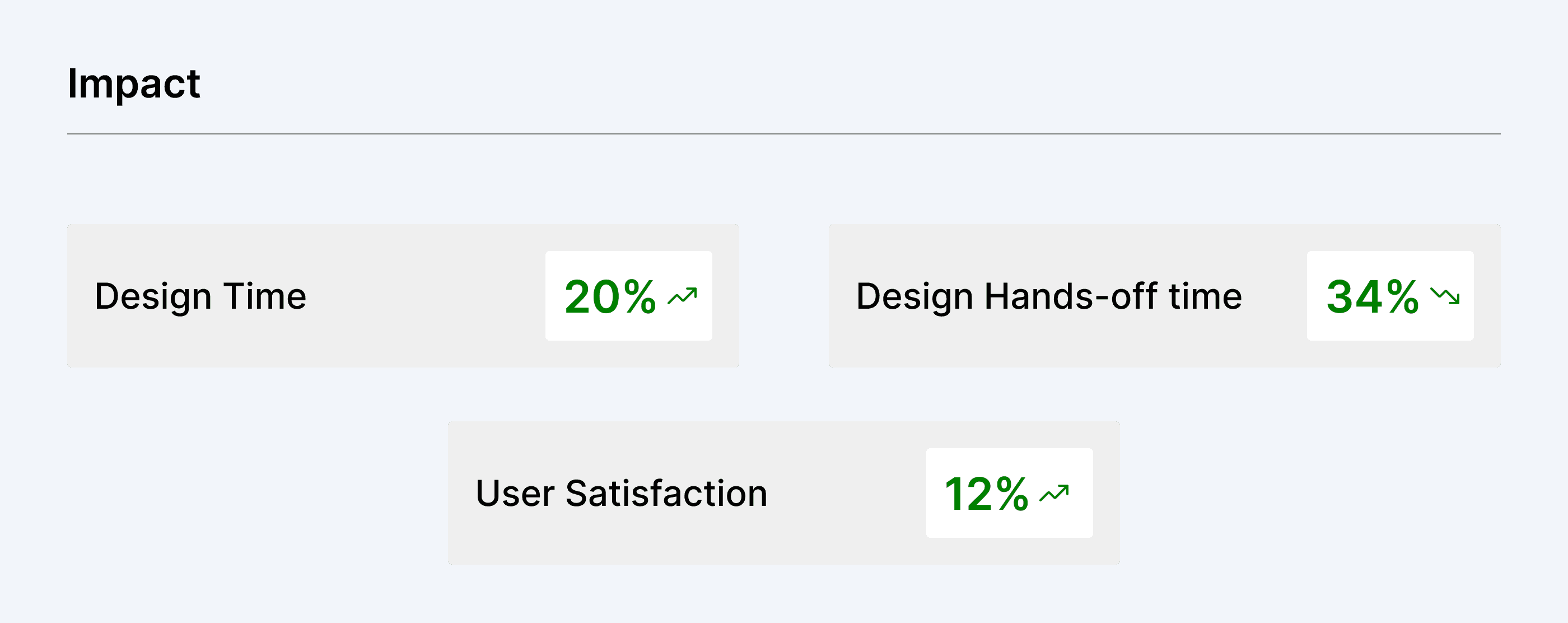
Impact
The implementation of a centralized design system significantly improved visual consistency across platforms, reduced design-developer handoff friction, and accelerated design cycles. It enabled seamless collaboration, minimized rework, and created a scalable foundation for future feature development—ultimately enhancing the overall user experience.
Implementing Atomic Design
We adopted Brad Frost’s Atomic Design methodology to create a structured, scalable, and maintainable design system. Its modular approach—breaking down interfaces into Atoms, Molecules, Organisms, Templates, and Pages—allowed us to:
Ensure consistency across components and screens
Build faster, using smaller building blocks to create complex layouts
Improve collaboration between designers and developers by using a shared language
Enable scalability, making it easier to update or extend the system as product needs evolved.
Goal 1 : Drive Visual & Functional Consistency
We set out to unify design patterns across the FedMobile ecosystem to reduce fragmentation. This involved standardizing colors, typography, spacing, and component behavior to ensure a cohesive experience across modules, platforms, and teams.
Goal 2 : Build a Scalable Component Library
To speed up development and reduce inconsistencies, we created a robust library of reusable components. These components were built to be adaptive across screen sizes and platforms, enabling faster iteration and easy scalability for future features.
Goal 3: Enable Efficient Cross-Team Collaboration
By shifting to Figma and implementing a centralized design system, we streamlined collaboration between designers, developers, and PMs. This improved handoffs, reduced duplicate work, and fostered a shared understanding of design standards across the organization.
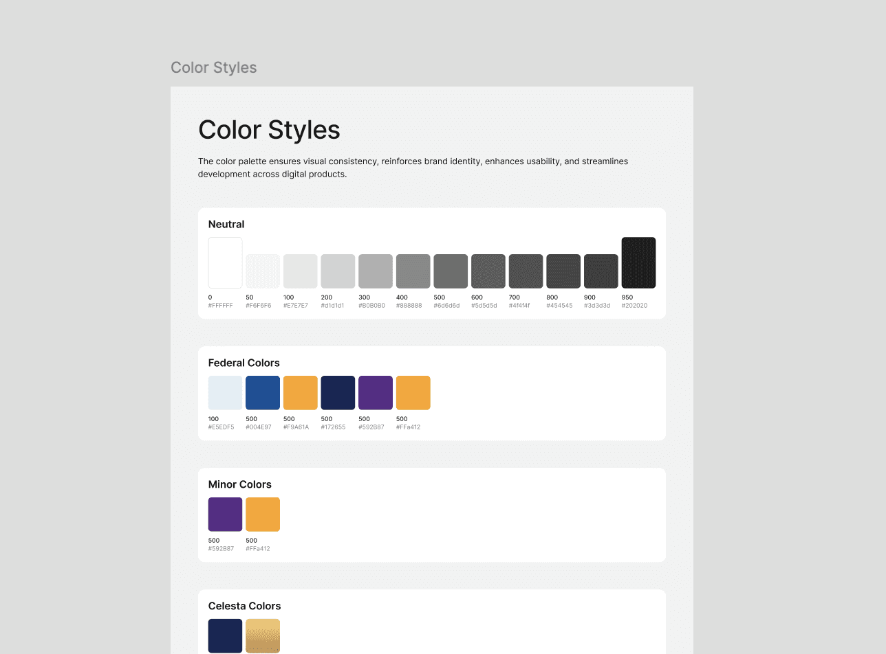
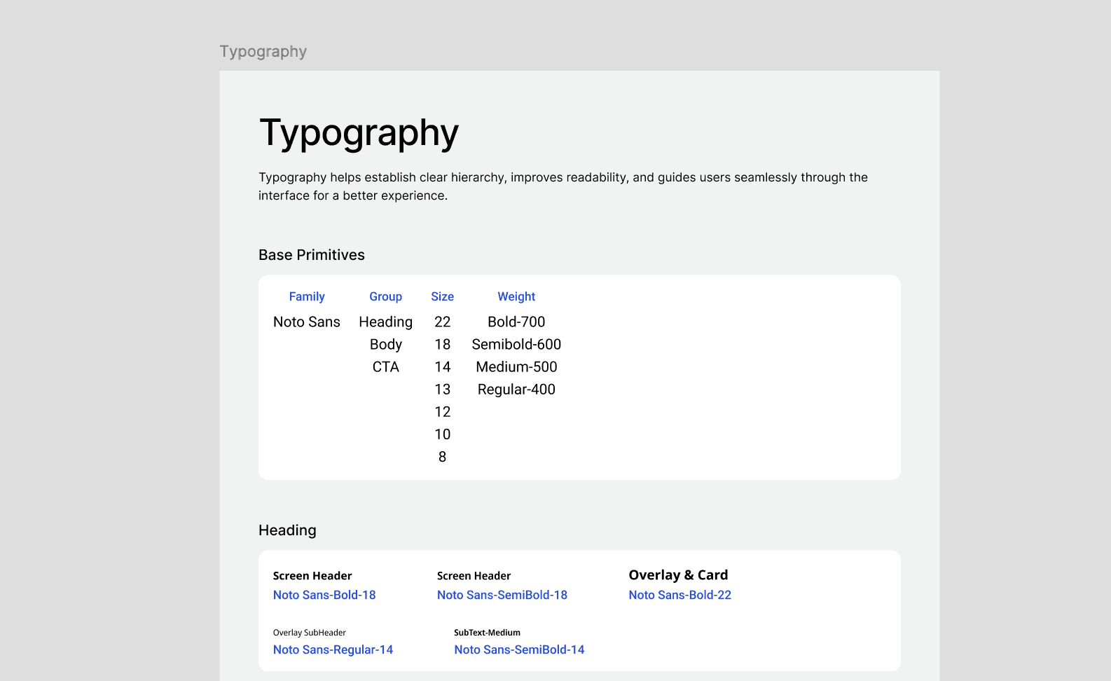
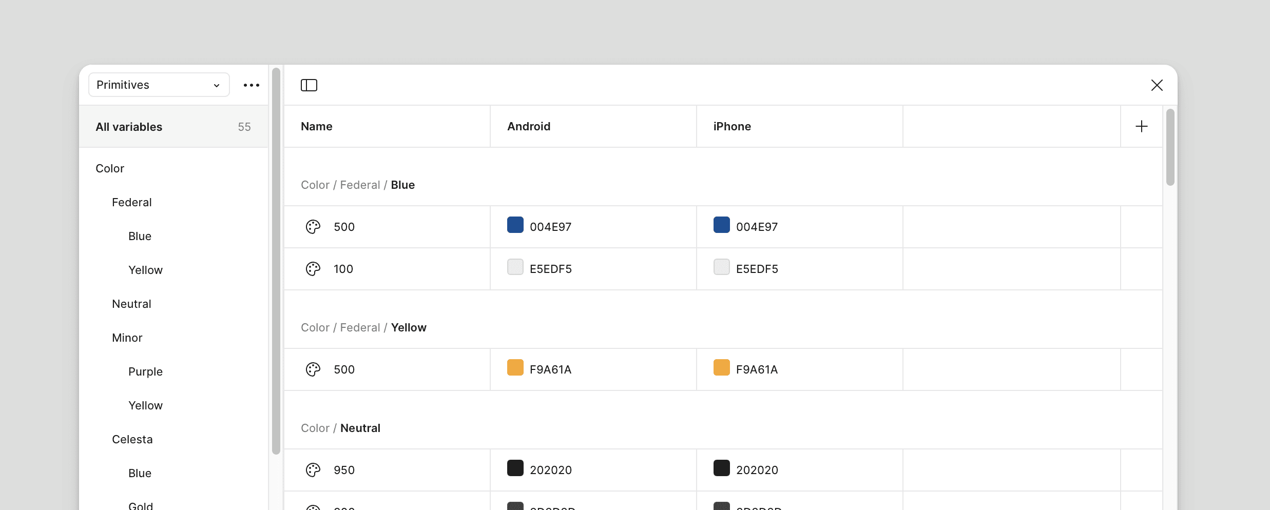
Using Figma Variables & Design Tokens
To streamline design updates, Figma Variables and Design Tokens were used to manage global properties like colors, typography, and spacing.
Figma Variables: Enabled quick updates to colors or fonts across all components through a single source of truth.
Design Tokens: Standardized properties such as shadows and border radii, ensuring visual consistency and simplifying developer handoffs.
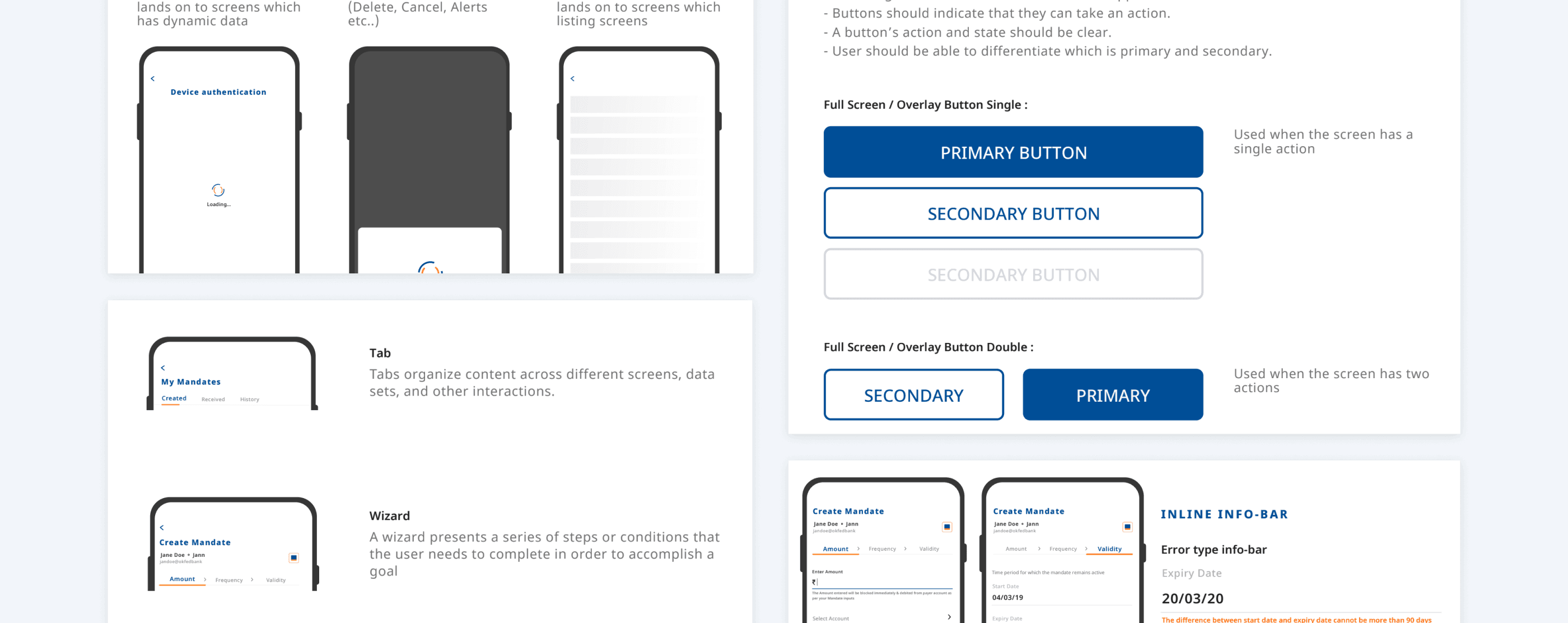
Documentation for Developers & Designers
A well-documented design system is key to ensuring consistent implementation and usage. A comprehensive style guide was created in Figma to document all components, variables, and tokens used in the system. This documentation included:
Component Usage Instructions – Step-by-step guidance on implementing each component accurately.
Naming Conventions – Standardized naming rules to maintain clarity and consistency across the team.
Accessibility Standards – Built-in WCAG-compliant guidelines to ensure inclusive experiences.
Implementation Scenarios – Real-world examples demonstrating how components adapt across different user types and platforms.
This documentation served as a single source of truth, enabling smoother collaboration between designers and developers and reducing onboarding time for new team members.
Challenges
Initial Resistance: Some team members were hesitant about moving from Sketch to Figma.
Balancing Customization and Consistency: Managing different user types while maintaining a cohesive design was complex.
Future Iterations
Automated Testing Tools: To validate accessibility compliance at scale.
Expanded Documentation: Including video tutorials for complex components.
Conclusion
Building a scalable design system for FedMobile was more than just about creating reusable components—it was about creating a unified experience that improved both usability and development efficiency. By leveraging Atomic Design principles and tools like Figma Variables and Design Tokens, I helped transform FedMobile into a platform that’s ready for future growth.
This project showed me the importance of balancing consistency and innovation, a challenge that ultimately drives long-term success and user satisfaction.
Thank you ! Do check out other work.