Boosted Deposits Experience — Achieved 18% Growth for Federal Bank - FedMobile
Let me take you through my process of redesigning Deposits, an important module for a banking app.

PRODUCT
SaaS Marketplace
PLATFORM
Web App
MY ROLE
Product Designer
Introduction
FedMobile is the mobile application of Federal Bank, a listed Indian company. With a customer base of over 10 million, including 1.5 million NRI customers, the bank has a presence across India and representative offices in Abu Dhabi, Qatar, Kuwait, Oman, and Dubai. The FedMobile app has been downloaded over 7 million times via the Android Play Store and Apple App Store. Federal Bank consistently upgrades the app to cater to every need expected from a bank, ensuring a comprehensive banking experience.
My Role
As the Product Designer, I led the redesign of the Deposits module on FedMobile to improve usability, trust, and adoption. My responsibilities included:
Auditing the Experience: Evaluated the current flows and screens to identify friction points, outdated UI, and information hierarchy issues that were causing user drop-offs.
Designing Solutions: Simplified complex steps, restructured the layout for clarity, and ensured consistency across all deposit types.
Cross-functional Collaboration: Partnered with Product Managers to align design decisions with business goals and collaborated closely with developers to ensure feasible and pixel-perfect implementation.
User-Centric Thinking: Advocated for better UX by prioritizing accessibility, clarity, and user motivation—ultimately enhancing user trust and improving engagement with deposits.
Problem 1 : Outdated Landing and Investment Screens
The deposit module’s entry points lack clarity and modern UX patterns.
Example
The landing screen presents dense, outdated visuals with no clear call-to-action or segmentation of investment types. Investment screens are text-heavy and fail to communicate value.
Impact: Users feel overwhelmed, leading to low engagement, poor first impressions, and missed opportunities to highlight high-interest or new deposit schemes.
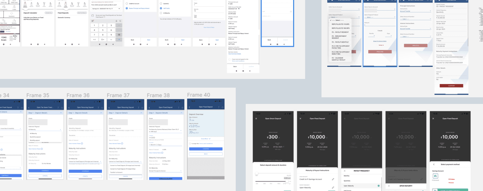
Problem 2 : Lengthy Deposit-Opening Process
Users are required to go through multiple redundant steps to complete a deposit.
Example
Opening a fixed deposit requires navigating through multiple screens, each asking for overlapping inputs like account selection and amount entry.
Impact: The friction in the flow causes drop-offs midway and discourages users from initiating deposits altogether.

Problem 3 : Missing Key Features
Users are unable to access popular deposit options, limiting engagement and cross-sell opportunities.
Example
Features like auto-renewal, premature withdrawal, other importnant features are missing from the experience.
Impact: Users are not motivated to explore or open deposits, leading to missed opportunities for conversion and a decline in overall engagement with the module.
Problem 4 : Poor Information Hierarchy
Critical information is buried within the interface and presented in a disorganized layout, making it difficult for users to understand and take action.
Example
Maturity dates and tenure aren’t visible at a glance — users must take extra steps to view them.
Impact: This creates friction in the decision-making process, reducing user confidence and increasing the chances of frustration.

Probelm Statement

GOALS
Business Goals
Increase deposit conversions
Streamline the journey and surface key deposit options to encourage more users to open and complete deposit transactions.
Drive retention through clarity and trust
Deliver a trustworthy and frictionless experience that motivates users to engage with long-term financial products.
Reduce drop-offs and support load
Minimize user confusion by addressing inconsistencies and poor information hierarchy, resulting in fewer support queries and higher completion rates.
User Goals
Quickly understand deposit options
Present critical information like interest rates, tenure, and maturity clearly, so users can make informed decisions confidently.
Complete deposits without friction
Simplify the steps required to open a deposit, minimizing effort and reducing abandonment through clearer flows.
Feel confident throughout the journey
Create a consistent experience across deposit types that builds familiarity and trust, reducing hesitation and boosting satisfaction.
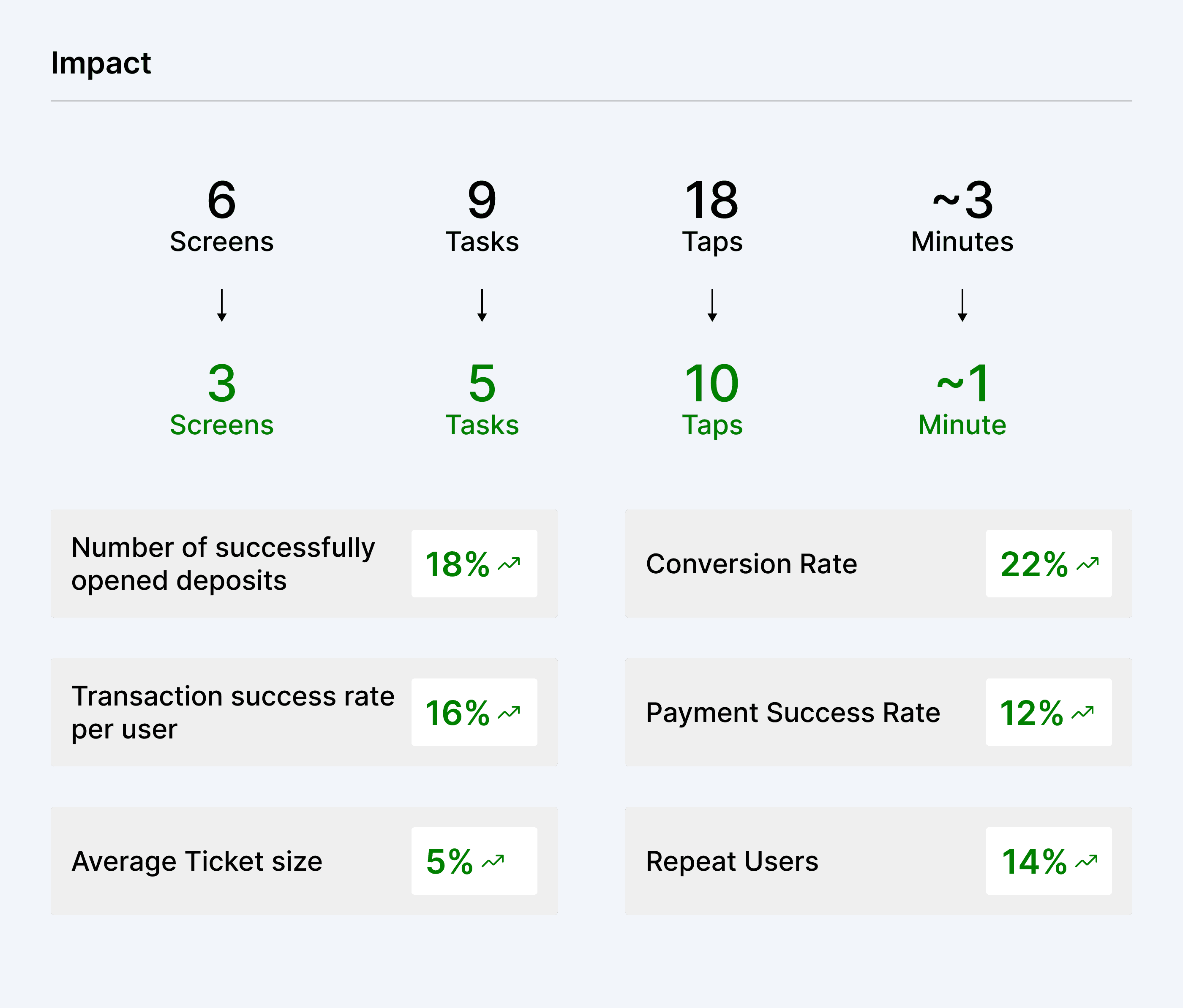
Impact
Increased engagement with key modules
A structured and prioritized layout helped surface revenue-generating modules more effectively, resulting in higher interaction and engagement.
Growth in session duration
With clearer navigation and reduced friction, users spent more time exploring beyond their primary tasks — reflecting positively in time spent per session.
Better visibility for business-critical features
By solving discoverability challenges and customizing module order, we were able to reduce the difficulty in promoting important services.
Positive user feedback
Early qualitative feedback confirmed that users found the new layout easier to use and more helpful for completing tasks — building user trust and satisfaction.

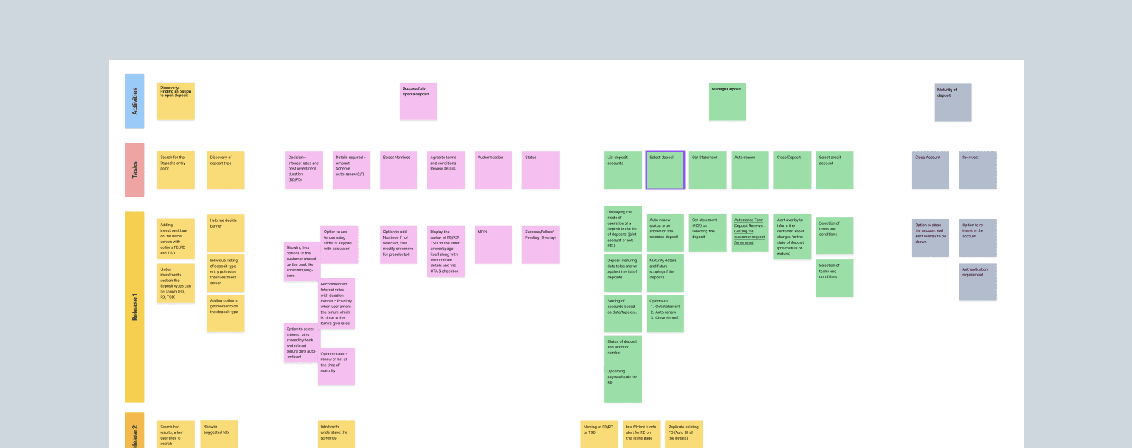
Solutions
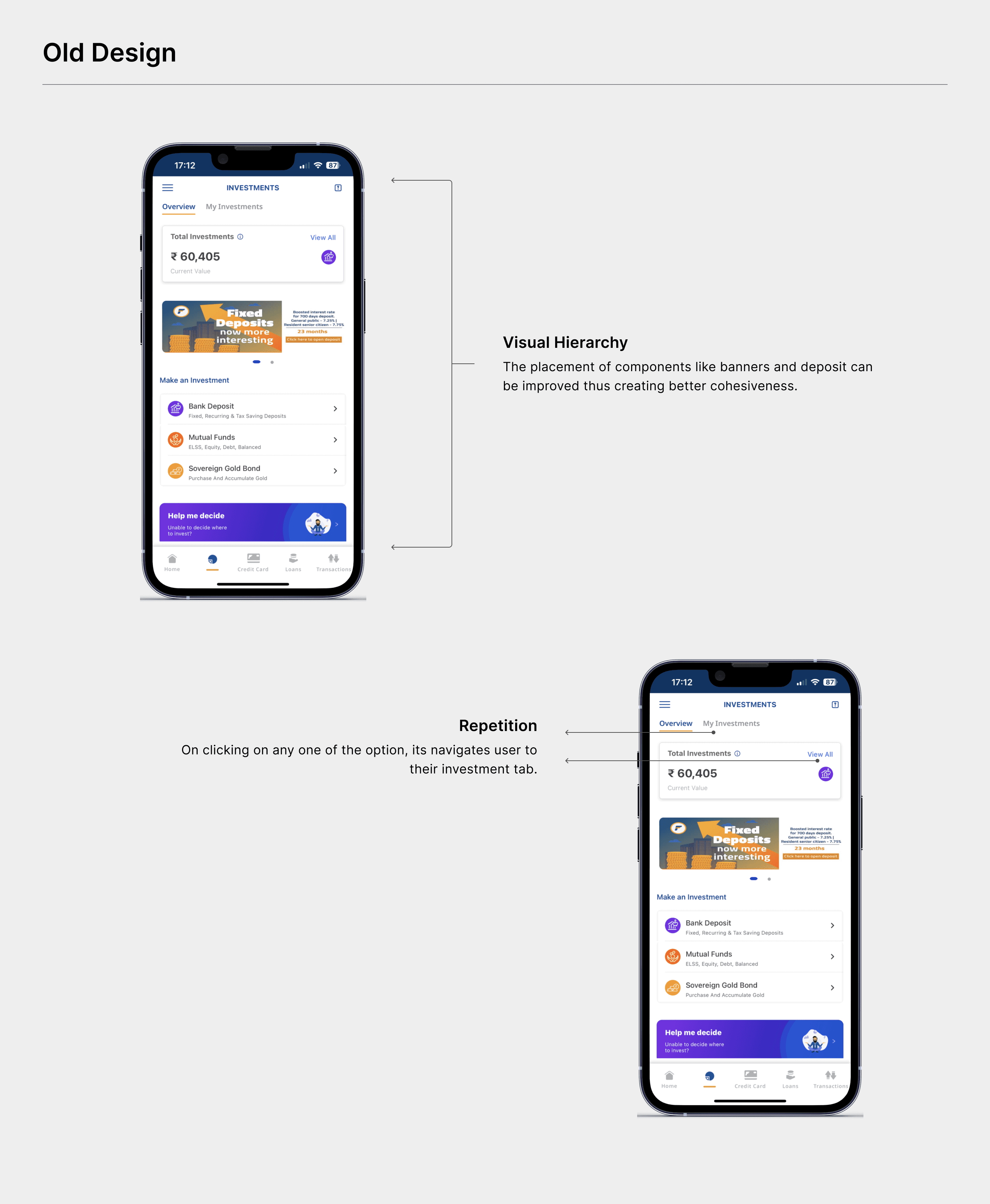
Investments Screen
The investment screen is the landing screen for users who want to open, view or modify their investments. The visual hierarchy is can be improved further along with placement of components link banners and deposit modules. There is redundancy to access investments.
In the new design, the tabs are replaced by a central card, which shows only two elements, Total investment amount and CTA to view all investments. A completely new section to show types of investments, thus helping users to select an option quickly. Introduced a new section highlighting popular deposits which will allow users to consider a better-suited deposit option for them. This also allows users to get a sneak peak of the tenures and interest rates.

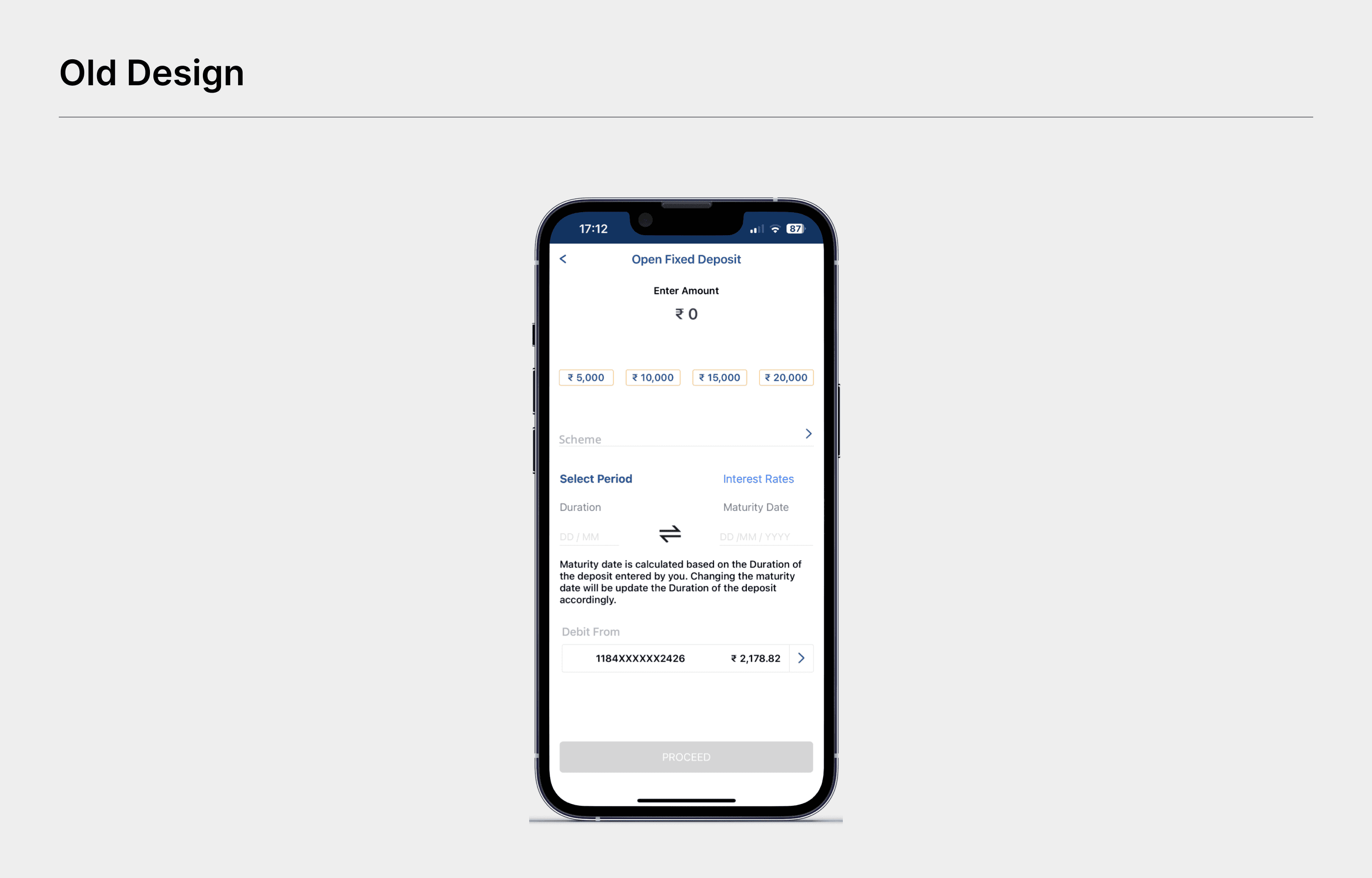
Deposits Screen
The existing screen of the deposit opening has an unclear visual hierarchy, leading to a confused user experience. There are multiple options but divided across subsequent screens, which prompts users to go through every option to open a deposit. Opening a deposit is a long journey for users. In the subsequent screens, we saw lots of drop rates, where users go back without opening a deposit. Multiple overlays to confirm entered details add even more friction. Every input or dropdown has been blank resulting in additional steps before proceeding further.
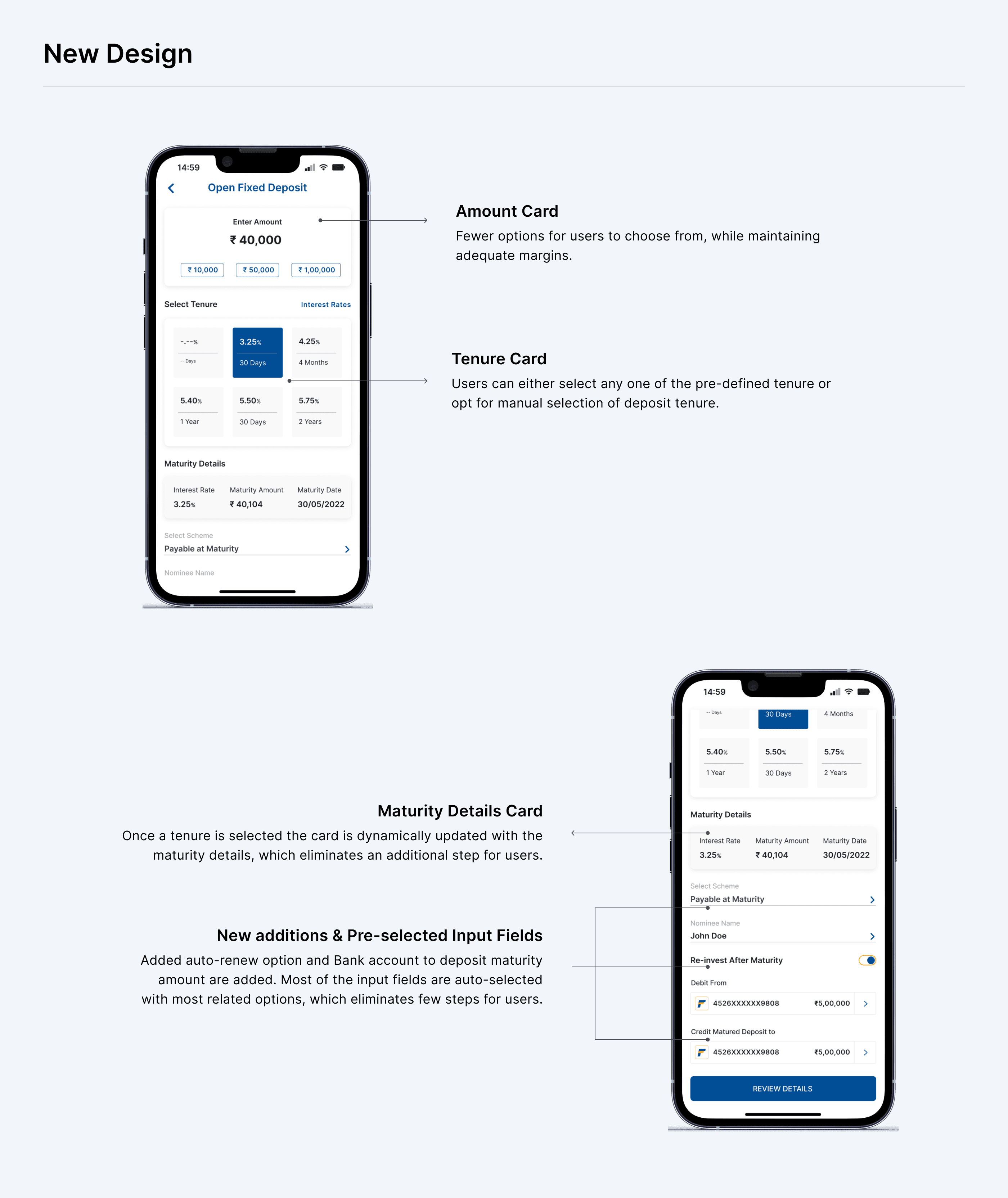
The cards have been updated with 3 pre-defined amounts instead of 4, which allows uniform margins between them. Introduced a new card to hold tenure along with interest rates. Users can either opt for any pre-defined tenure or manually select tenure, thus allowing greater flexibility. Every input or dropdown field has been auto-selected allowing users to review instead of spending time selecting the options. The option to change the selected option is always available. In the new design a couple of additional options are added:
- Auto-renew deposits
- Maturity details card to show the details
- Bank account to deposit maturity amount
Every necessary component has been added to a single screen for better control. We decided not to use progress as we were able to accommodate elements on the deposit screen without overwhelming them.
Review Screen
The existing review screen has a few inconsistencies in the visual hierarchy. Also there are a few details that were missing but necessary for users.
The new design is updated with a better visual hierarchy and added all the necessary details related to the deposit. This is the last step before opening a deposit.

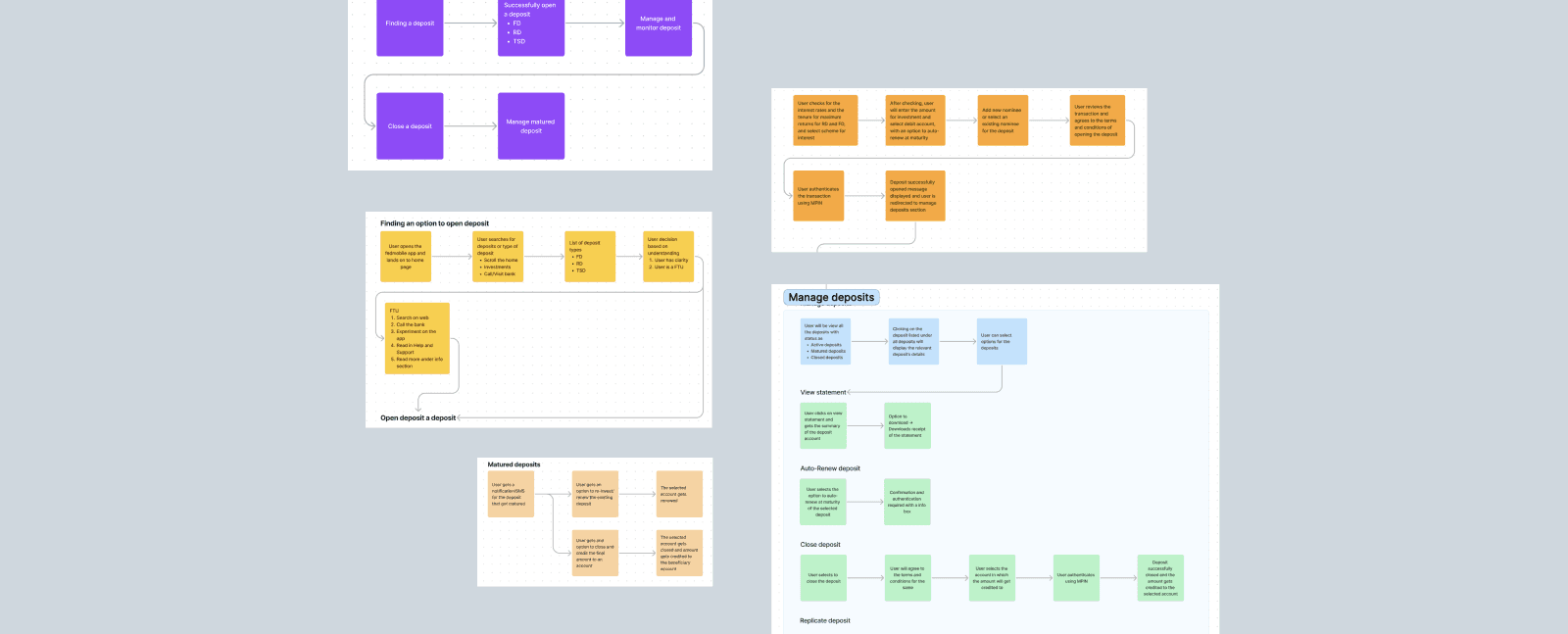
My Deposits Screen
My deposits consist of all the deposits a user has made. The existing details were less useful for any user. When a user wants to know any additional detail they have to go through a subsequent screen.
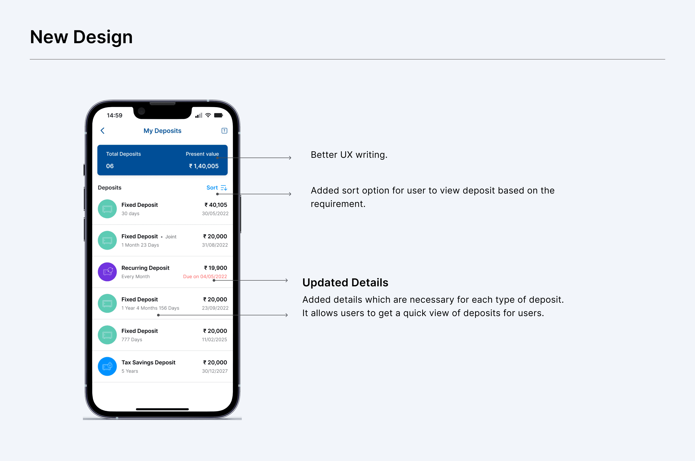
The new design is updated with better UX writing, added necessary details like tenure, maturity date, and present value of investments, among others for each type of deposit. This allows users to get a quick view of the necessary details of each deposit. A sort option is added to the new design which allows users to view deposits based on their requirements.
New deposit type: smartFD
A new deposit type is added, which allows the users to get better returns on the money than they get from the saving account. It also allows the bank to get more deposits which they can forward as loans. It is an activation allowing the bank to take ownership of the money in the savings account. As it is implemented for the first time, emphasis is given to making the user understand in the simplest way possible.

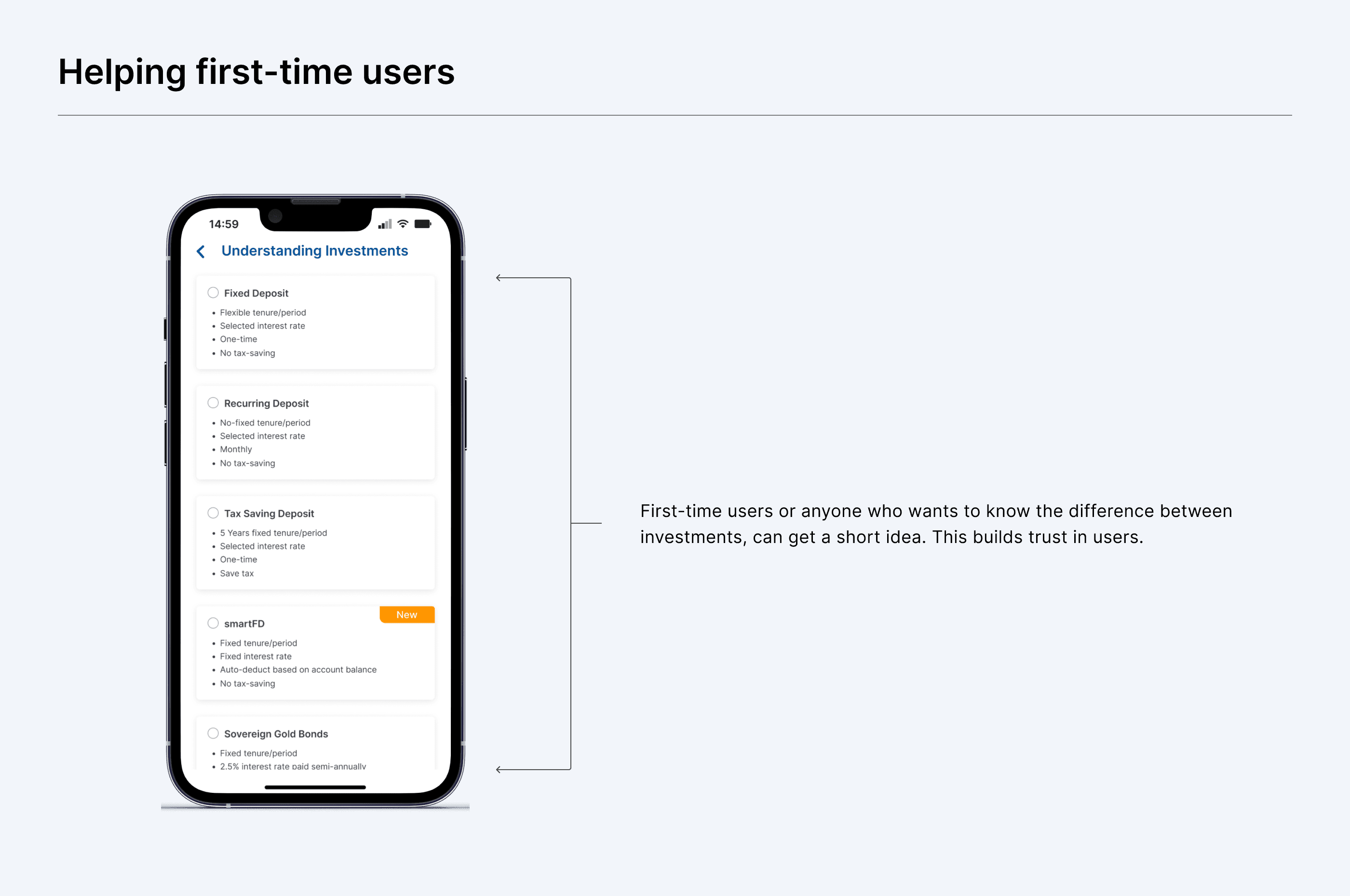
Educating first-time user
In the earlier version, we don’t educate the first users or explain in brief to any users who want to understand what are the differences between each investment. In our research, we got to know users are apprehensive about new investments as they fear any wrongdoing. Even though the existing design has a section to help users but many users are not aware of it. So, we added a new screen for anyone who wants to know the difference between investments or first-time users who want to get a glimpse. By this, we wanted to build trust in users so that they can get better ideas and invest based on their needs and goals.